


The fonts you select for your email templates affect the readability and appearance of your newsletters, transactional messages, and blast campaigns. What are the best fonts to use for email? Find out how to decide for yourself in this article.
Does the font you use in your email messages matter?
If you doubt the answer is a resounding yes, you need only review the storied history of the much-maligned typeface Comic Sans.
A Microsoft designer created Comic Sans in the mid-90s as a casual font reminiscent of comic book text.
People don’t like it. Well, some people, anyway.
I mean, the font can’t be reviled universally, or it wouldn’t still be around, right?
Love it or hate it, like other typefaces or font families, Comic Sans evokes an emotional response in people.
Other fonts do, too.
Sometimes, that response is cultural.
For example, the initial tide of Comic Sans negativity traces back to two graphic designers who were required to use the font against their better creative judgment.
So the font may just be a casualty of a call to arms by artists pushing back against the invasion of non-creatives into their jurisdiction.
But often, our responses to the visual cues of different fonts are unlearned and subconscious.
We know that a particular shape or pattern, including the strokes of a letterform, makes us feel a certain way.
However, we can’t say exactly why it elicits that response.
The psychological effect of different typefaces or fonts isn’t the only reason the font you use in your emails matters, though.
Ensuring an end-to-end excellent experience by optimizing your email marketing operation improves campaign engagement levels and your email program’s deliverability metrics.
Fonts that don’t harmonize with your other design elements can detract from the focus of your message and make your emails look unattractive.
Meanwhile, fonts that don’t render because they aren’t supported by the email client or are illegible or difficult to read prevent you from communicating effectively with your subscribers.
The best fonts for your marketing emails are ones that check all the boxes for design and technical suitability.
These fonts unobtrusively support your campaign objectives by reinforcing your brand’s image and your email’s message.
How can you find the perfect font to represent your brand and ensure that you communicate your message clearly in every email?
I’ll share our top technical and design tips for email fonts in this article.

What to look for when selecting the best fonts to use in your email newsletters and marketing communications
If you think choosing the fonts for your email newsletters and other messaging is easy, you should know that the Google Fonts library has more than 1,400 fonts from which to choose and Adobe offers over 20,000 options. Each year font foundries and individual creators and brands introduce more new fonts.
With all these options, how does anyone choose which fonts to use for their emails?
What are the characteristics of a good email font?
The fonts you select to use in your email messages must be suitable for the medium and positively contribute to your subscribers’ experiences with your brand.
Email fonts must be accessible and expressive, displaying correctly across email clients, reading panes, and devices. Otherwise, all your carefully made design decisions will be ineffective.
Because email fonts must deliver technically and from a design standpoint, the fonts that are best for a particular email campaign or part of an individual email message or template won’t always be the same.
The best fonts for newsletters are:
🖋 Available in formats that render correctly across different devices and email clients.
🖋 Legible and readable.
🖋 Representative of your brand’s personality.
🖋 Appropriate in tone relative to the purpose of the message.
🖋 Suitable for the hierarchical position in the email and supportive of your design objectives.
Use the following guidelines to identify email fonts that meet your technical and design criteria.
Then add your favorite fonts to your style guide and email content checklist so that you can develop new templates quickly and maintain consistent quality across all your campaigns.

What are typefaces, font families, and fonts in typography (and email HTML code)
Before I explain how to choose the best fonts for your email campaigns, let me start by explaining what a font is in this context.
Most of us use the term “font” to mean both individual fonts and typefaces, a habit we picked up from the way word processing programs use the term.
But within the field of typography–the art of arranging type for printing or display–the words font and typeface don’t carry the same meaning.
“A typeface is what you see; a font is what you use.” ~Elliot Jay Stocks for Google Fonts
Not to be confused with specialized vessels used to hold oil 🏺 or water ⛲, a typographical font refers to a collection of letters, numbers, punctuation, and other characters that were designed to go together.
More specifically, a font is the physically printed or digital representation of a typeface.
In typography, a typeface is defined as a comprehensive collection of characters intentionally styled for use as a set.
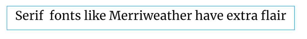
When you look at a typeface’s characters, you should be able to identify a pattern of shared characteristics. For example, all the lowercase letters will be of similar height, and the capital letters will all have those extra little dashes of flair called serifs.
Straight or curved and thick or thin lines, diagonal or vertical orientation of a letter’s stroke, the use of flourishes, and spacing all contribute to a particular font or typeface’s appearance.
The term typeface dates back to the pre-digital age when text was typed physically or printed using inked blocks.
A font is a specific typeface in a specific size, weight, or style such as bold or italic.
To print or type physical copy, the printer had to select not only the style (typeface) but point size and other attributes for the character set before setting the type into a block or choosing the typewriter’s character wheel or type element.
When these specifications were defined, the result was a font.
Then and now, a single typeface could be the source of several fonts or variations.
When a digital file is created for a typeface, the various fonts within that set collectively are called a font family. Although we often use the terms “font” and “typeface” interchangeably, “font-family” is the better modern synonym for typeface.
Font-family resemblances: The typeface Arial appears differently depending on its font-level characteristics
| Arial, 11 pt. | Check out The Email Marketing Odyssey at Ongage.com/blog. An email marketing blog for newcomers and experienced explorers, focusing on hot topics, insights, and strategy. |
| Arial, 16 pt. | Check out The Email Marketing Odyssey at Ongage.com/blog. An email marketing blog for newcomers and experienced explorers, focusing on hot topics, insights, and strategy. |
| Arial, 11 pt., bold | Check out The Email Marketing Odyssey at Ongage.com/blog. An email marketing blog for newcomers and experienced explorers, focusing on hot topics, insights, and strategy. |
| Arial, 12 pt, italic | Check out The Email Marketing Odyssey at Ongage.com/blog. An email marketing blog for newcomers and experienced explorers, focusing on hot topics, insights, and strategy. |
In your email templates, you may designate font selections in your email’s header and add fonts using a <link> instruction in your HTML or with “@font-face” or “@import” CCS embed codes.
Does it really matter whether you use the term typeface or font?
While you’re probably safe using the term font to refer to your selected character set, printing, graphic design and other professionals who work in typography may need to be more specific to ensure that everyone is on the same page when it comes to preparing content.

What are email-safe fonts and how do you designate fonts in your email templates?

Email copy–the numbers, letters, and other symbols that you use to communicate with subscribers in your emails–starts as an idea.
Those ideas reach your audience when you convert them into a format capable of being displayed. The characters that communicate your message must be digitized and produced for viewing in your recipient’s email reading pane.
Font and file type both guide how those characters are displayed.
Email messages can only be displayed using a selected font if the recipient of the message has a file instructing their device how to display that font. This is why choosing a “safe” font for your emails (one that is likely to be available on most of your subscribers’ devices) is critical.
If the font or fonts you designated in your email templates aren’t compatible with your recipients’ device or email service provider, then they won’t see your message in the way you had planned.
Degrees of safety: The 3 types of font files to designate in your email templates
The style of digital text or copy is defined using files that include all the information necessary to create a display of each character in the specified font’s style. These files may be in OpenType (oft) or TrueType (ttf), and may be further packaged as Web Open Font Format (WOFF) files.
These font instructions are stored in system font, email- and web-safe font, and web font files.
➡ System fonts are the fonts supported by a device’s pre-installed files.
➡ Email- and web-safe fonts are fonts that are more likely than not to be accessible to a subscriber, and thus considered “safe” choices for formatting digital text. Email- and web-safe fonts may be system fonts but include other commonly supported fonts as well.
➡ Web fonts are not installed on a device’s local directory but are accessible only from a separate server.
System fonts
Any font available through a device’s local directory is a system font. System fonts may be further separated into those files that are pre-installed and user-installed.
Every device comes with pre-installed fonts to support its user interface. Often, new fonts are installed when the device’s owner installs additional software or adds fonts to an existing program. All of these add to the variety of fonts available for use on the device.
If the font you’ve selected for your email is among the fonts commonly found on users’ devices, then your text can be displayed in that style.
Common system fonts
- Arial
- Helvetica
- Roboto
- Verdana
- Tahoma
- Trebuchet
- Times New Roman
- Georgia
- Courier New
- Brush Script
- Impact
(Source: Google Fonts knowledge base)
Not every system font is a safe font to use in your email templates, however. A system font may be unique to one operating system or device. (Windows or Mac desktops and laptops will usually have more system fonts installed than a mobile phone or tablet.)
To be a safe font, a system font must be cross-platform–installed across different devices and operating systems–and popular.
This is the crux of selecting the best font for email messages–finding the fonts that are most likely to be accessible to the most recipients. For instance, if the majority of your subscribers are Gmail users, you would select a font that optimizes their experience. Then you would add fallback fonts suitable for your non-Gmail subscribers.
Email- and web-safe fonts
Since there are no guarantees that a font will be available on every device, which fonts qualify for inclusion on the safe font list is debatable. The closer a font is to “always going to be there,” as opposed to “I’d better have a backup,” the more likely it is to make the email-safe or web-safe list.
Some email font lists distinguish between email-safe fonts that are highly likely to be accessible or installed and web-safe fonts that are just likely to be so.
One reason for this is that HTML and CSS for websites are more uniform in their application than it is for email. Different email clients may treat the same instructions or files in different ways. So, those choosing fonts for emails must be more cautious than their web design counterparts.
In general, fonts that are popular with only one platform, such as Mac’s Helvetica, are considered safe but not as safe as other choices. The same is true for serif and sans serif font classes versus script, fantasy or display fonts because these latter fonts are used less often.
The best email-safe fonts
Arial (Sans serif)
Verdana (Sans serif)
Tahoma (Sans serif)
Trebuchet (Sans serif)
Times New Roman (Serif)
Georgia (Serif)
Courier New (Serif, monospace)
These fonts are widely used and installed on most devices, and the fonts’ styles are relatively neutral.
A non-exhaustive list of web-safe fonts
| Sans Serif fonts | Serif fonts | Others font styles |
| Arial | American Typewriter | Bradley Hand (Script) |
| Arial Black | Bodini | Brush Script (Script) |
| Bookman Old Style | Book Antiqua | Charcoal (Display) |
| Calibri | Courier New (monospace) | Impact (Display) |
| Century Gothic | Didot | |
| Comic Sans | Garamond | |
| Geneva | Georgia | |
| Helvetica | Lucida Console (monospace) | |
| Lucida Grande | Monaco (monospace) | |
| Lucida Sans Unicode | MS Serif | |
| Symbol | New York | |
| Tahoma | Palatino | |
| Trebuchet MS | Times New Roman | |
| Verdana |
Remember, though, these fonts are more likely to be supported on desktop and laptop devices than mobile ones.
You can find and preview a huge selection of fonts and experiment with different style attributes available for use in emails at CSS Fonts.
💻 In the above sample, I used CSS’s preview tool to see what the Arial typeface in bold and small caps will look like.
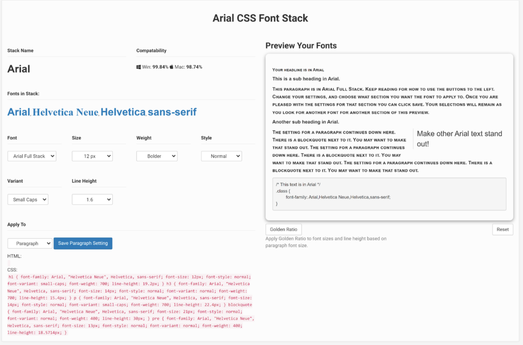
To designate a system or safe font as the display font for an email, you can use your WYSIWYG editor or add your selection to your HTML code.
Use the <style> designator in your email header or inline. Then use the CSS font-family property to indicate your choice.
Web and custom fonts
What if you don’t find what you’re looking for among the many available system and web-safe fonts?
You aren’t limited to using only the fonts supplied by your subscribers’ email client or those installed on their devices to design your web copy. You can also import font files from internet servers to direct how the characters in your text are displayed.
These web fonts are derived from files that don’t live in your subscriber’s local directory or their email client’s server. You can find thousands of web fonts at type or font foundries such as the ones listed on the Adobe Fonts website or create your own custom font and host it on your server.
Don’t go overboard with these uncommon fonts, though. Some email clients don’t support web fonts yet. The format was created for use on websites and HTML support remains a work in progress.
Currently, Apple Mail, iOS Mail, Google Android Mail, and Outlook for macOS/Outlook 2000, Outlook.com app, Outlook Mobile app, Thunderbird, and Samsung Mail (version 8.0 and above) support most Web Open Font (WOFF) or web fonts.
Gmail supports just two: Open Sans and Roboto.
To use a web font in your message, you have to load the font using an HTML <link> instruction or CSS @import or @font-face embed code. Visit Can I Email to see a list of operating systems and email clients that support each method.
You can add instructions for loading web fonts in your HTML <head> in the <style> tag to make an initial designation. Direct email clients to the URL provided to you by the font’s vendor or the font’s location on your servers.
💻 Google Fonts provides access to more than 1,400 open-source font families. On the site, you can view text and glyph samples for each font family and obtain <link>, @import and CSS snippets to include in your email template’s HTML.
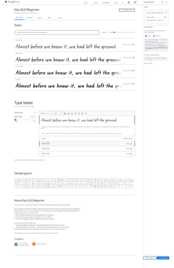
The HTML @import code to load Google Font’s Edu QLD NT Beginner font in medium weight looks like this:
<style>
@import url(‘https://fonts.googleapis.com/css2family=Edu+VIC+WA+NT+
Beginner:wght@500&display=swap’);
</style>
Not every email client supports the <style> tag, so you should also plan for a fallback font or use inline CSS to assign your font.
⚠️ Avoid complications by designing your font strategy defensively using the parameters of the devices and email clients used by the greatest number of your subscribers in mind.
How to encode fallback email fonts to ensure your message renders well
If the font you’ve selected for your email isn’t available, your subscriber’s email client will default to a predetermined system font. Each email client uses a different default or fallback font for emails that arrive as plain text (no font designation) or an invalid font selection.
Allowing each email client to choose the fallback font for your messages can result in your messaging looking nothing like you had planned. Avoid losing your design intent by adding your own fallback fonts to your emails using the CSS font-family property.
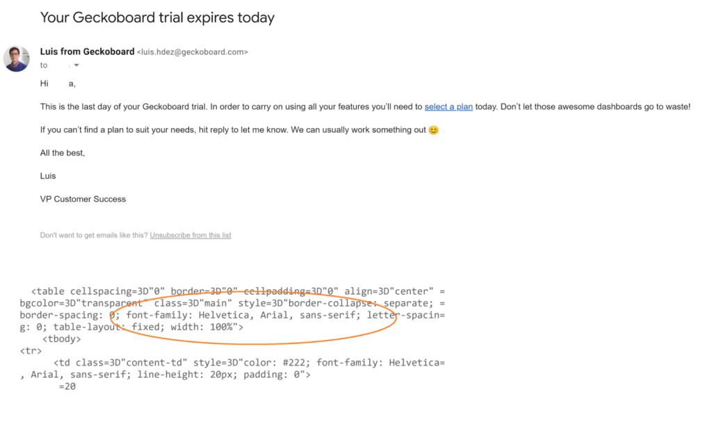
📧 The CSS for this email from Geckoboard designates Helvetica as the preferred font and Arial as the fallback. The email message in the above sample was displayed in Arial.
To encode your choices, add a font-family snippet that first lists your chosen font, then lists one or more alternatives.
Prioritize your list of alternatives by design preference and likelihood of success. Include at least one safe alternative and add an extra layer of security with a generic font class selection.
font-family: “Comic Sans”, “Sans Andreas”, Arial, sans-serif;
In the example fallback snippet above, the “sans serif” selection at the end tells the client that if none of the choices are available, select a font that is in the sans-serif class.
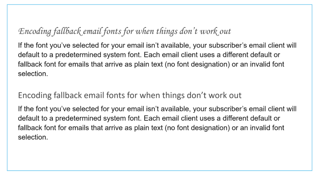
When choosing a fallback font, it’s important to select alternatives that have similar attributes to your design font. If not, the appearance of your email may be radically changed.
For example, if you designed an email with headers formatted in an ornate font, but named a contemporary font as your alternative, the visual impact of the two wouldn’t be the same.
A single change in the font used for the headings alters the readability and impact of these two copy samples pictured below.
Differences between fonts in images versus text: Not all email copy is rendered using font files

Usually, when email marketers discuss the best fonts for email, they are referring to fonts displayed as text.
However, fonts appear in images, too.
There are advantages and disadvantages to using both text- and image-based fonts in emails.
The appearance of text-based copy is governed by font files, while the appearance of copy in images is a product of the graphic designer’s choice (and may include freestyle lettering or the use of typefaces available through their design software).
Often marketing emails use a combination of text and images, like the examples in our article highlighting email newsletters.
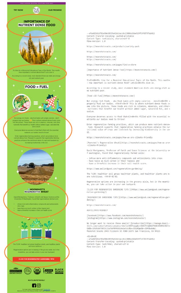
📧 The email newsletter pictured below from Moonshot is colorful and filled with engaging graphics that support the message’s narrative. But the brand also includes text-formatted copy to tell its story. A look at the email’s code reveals which formats were used for each section.
Pros and cons to consider when choosing whether you’ll display your email’s copy in text or image formats
- Using a text format for your copy is a simple solution that avoids problems such as image blocking that can prevent your message from reaching every subscriber.
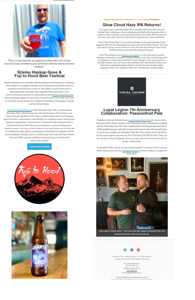
📧 Text is the primary medium in this email newsletter from Gigantic Brewing. The images included in the email are engaging and illustrative but not essential.
- When your copy is fixed in an image, making corrections or changes is more complicated and may require more team members and more lead time to execute.
A misspelled text entry can be deleted and replaced with a few keystrokes. Graphically represented text has to be removed and replaced using graphic design tools.
- Screen readers and other smart devices can’t detect copy in images making image-first emails less accessible to your subscribers who are visually impaired or prefer to hear their emails read to them.
- Text-based emails can be more reliable in terms of download times and display in dark mode.
- Copy in text format isn’t fixed in place like words and characters that are part of an image. Changes to the style or size of your font will change how your copy appears in relation to the other parts of your email.
For example, a header that fits perfectly before a font change may overrun a nearby product image. When your copy is embedded as part of an image, it stays exactly where the designer puts it.
- When using text-based copy, your selection of available fonts will be limited to those that are supported by your recipients’ email clients or devices. Your design choices are constrained to “safe” fonts unless you use CSS codes to add font files.
Copy in images does not require separate font support, giving designers the ability to use different fonts without concern for whether they are supported by the recipient’s email client or device.
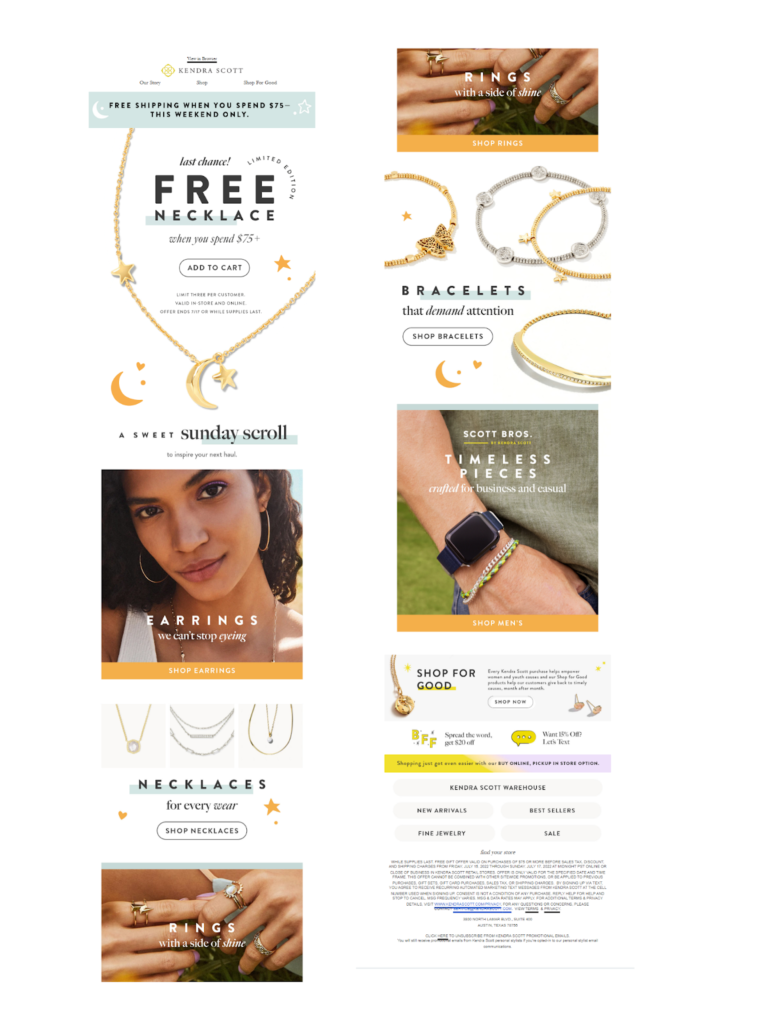
📧 Nearly all the copy in this promotional email from the jewelry store Kendra Scott is part of the message’s image file. Only the CTA and footer copy are in text format.
- When letters, numbers, and symbols are incorporated into a graphic design, there are no limits on how much they can be customized.
You can add or remove details pixel by pixel, alter the spacing of characters and interweave them with other design objects to create a cohesive image.
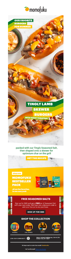
📧 Online food distributor Momofuku merges its message with colorful images of the brand’s products to create an appetizing appeal.
- Image-only emails are sometimes perceived as less credible than those text-only or text plus image emails.
Internet service providers and email clients consider them a spam signal and may limit your access to subscribers’ inboxes if these and other bad sender signs reach a critical mass.
- Images are the best choice for displaying copy that is tied to a specific font and layout, such as your brand’s logo.
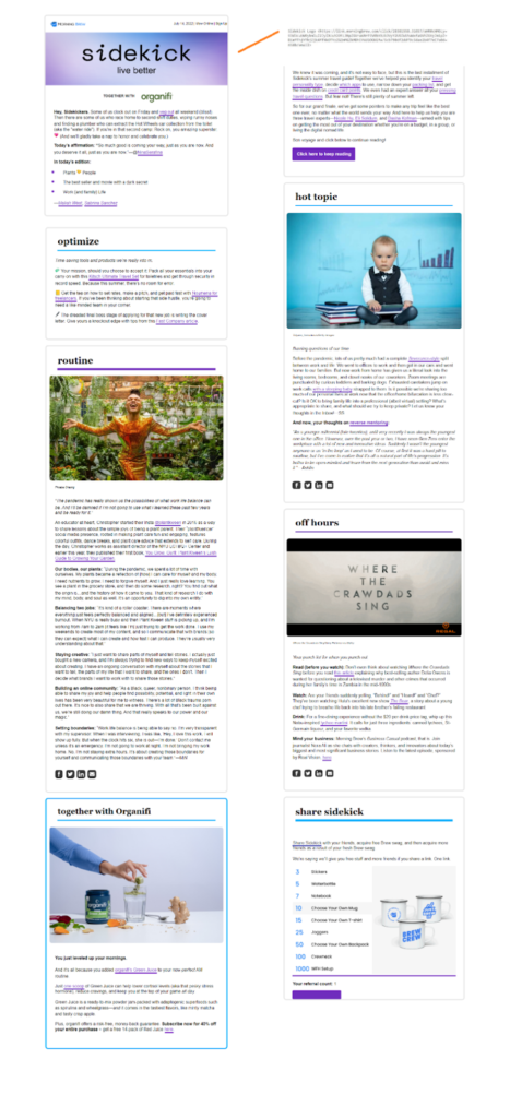
📧 Most of Morning Brew’s Sidekick newsletter is presented in text format. But they went with an image to show their style in the title.
Companies that are associated with a distinctive typeface, such as Coca-Cola’s signature script, may not want to build a full font-family to replicate their logo’s style. Others, such as Netflix, go all-in and build customized fonts to support their branding.
When should you skip the file and just put your email copy in a graphic?
Can you avoid the whole safe font issue by using graphics to display your email’s copy? Well, you could.
Your audience, brand personality, and the objectives of the message should be the primary considerations when choosing whether to send a text-only, image-only, or hybrid message.
After all, your business isn’t sending emails for nothing. The emails you send are part of your brand’s complete, cross-channel presentation.
But you should also think about how the format or formats you select will affect your font choices and the ease of executing those choices.
An email campaign that can be produced efficiently or practices that don’t scale will bog down your program’s ability to achieve its performance objectives.
In most instances, we recommend using text-only or text-plus-image emails to maximize accessibility, engage subscribers and avoid triggering ESP’s spam filters. Use images to present copy when the fidelity of your font’s style is critical and text-based typefaces don’t measure up.
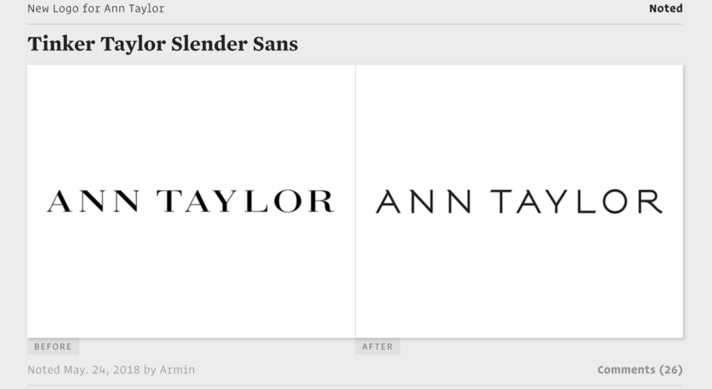
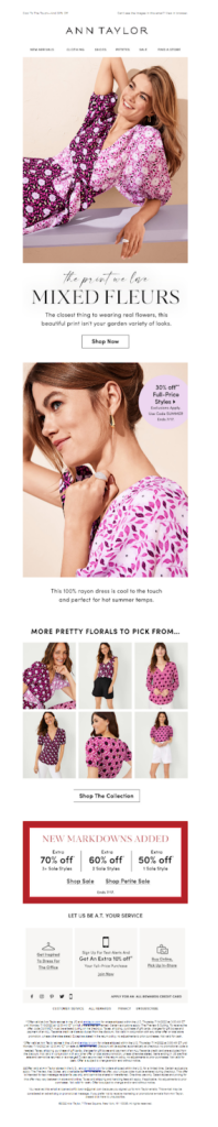
Clothier Ann Taylor’s current logo uses a customized font introduced as part of a 2018 logo upgrade and represents a modern, yet elegant style. Images of the logo before and after from the Brand New logo archive are pictured below.
Ann Taylor newsletters employ a mix of image- and text-based fonts including cursive script and chunky display styles (see example below).
📧 Ann Taylor’s emails are topped by the brand’s logo font preserved as an image.
If you plan to use complex fonts that don’t score well for readability or legibility in your email newsletters, use them sparingly. The objective of your marketing emails is to communicate your message to subscribers.
Don’t allow form to override function.
Select fonts that work across devices, reflect your brand’s tone of voice and support your CTA. Then leverage the flexibility of combining text- and image-based copy to incorporate dynamic content, including customized product recommendations, into your email templates to build hyper-personalized messages at scale.
Also, remember that if you don’t choose a font for the text portions of your email templates, your messages will display in a default style or the one your subscriber has chosen in their email reader’s settings. Similarly, your subscribers who choose to view messages in plain text only will see your copy in its most basic form and in their chosen or default font.
What else should you consider when selecting the best fonts to use in your email templates?
The best fonts for newsletters and marketing campaigns are readable and legible
When crafting marketing emails, the aesthetics and visual impact of a particular font should always be secondary to its suitability as a means of communication.
In other words (pun intended), if your subscribers can’t read your message, your font is a failure.
The font or typeface you select along with other typographic design decisions such as color, line spacing, and text alignment, will affect the legibility and readability of your copy.
What do these terms mean?
Legibility and readability are similar concepts but not identical.
In the context of typography, legibility refers to the discernability of the characters or set of characters in a piece of copy.
Can the viewer see and distinguish between the individual elements (whether words, numbers, or some other combination)?
In this sense, legibility is concerned primarily with the physical display of the text. A piece may be readable but rendered illegible because of a design choice.
Readability is a measure of how easy it is for someone to consume and understand your content. You’re probably familiar with readability scores that indicate the “reading level” of a particular piece and know that this level influences your audience’s willingness and ability to understand what you’ve written.
A message’s readability isn’t just influenced by your word choice or sentence structure.
A piece of content that is otherwise readable will become unreadable if it is illegible. Additionally, some typefaces are more difficult to read than others–particularly for individuals with reading-related disabilities or visual impairments.
In this situation, readability and legibility will impact accessibility of your content. For example, your copy may use level-appropriate words displayed legibly, and still be difficult for someone with dyslexia to read because of the unique characteristics of the font.
6 factors that impact a font’s readability and legibility
The following font attributes, either alone or in combination with other design decisions, will affect your email content’s legibility and readability:
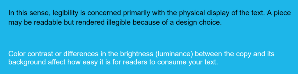
Color contrast: The intensity or difference in brightness between the copy and its background affect how easy it is for readers to consume your text.
Leading: The line spacing affects the readability and legibility of your copy as well.
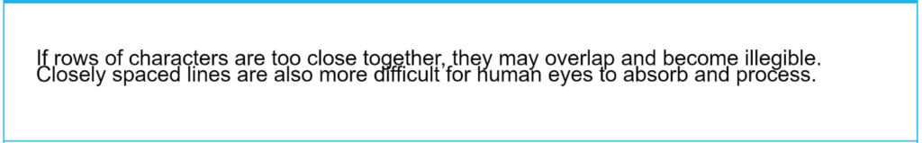
If rows of characters are too close together, like in the example below, they may overlap and become illegible. Closely spaced lines are also more difficult for human eyes to absorb and process.
Line spacing is measured from baseline to baseline (the imaginary line upon which each row of copy sits).
The vertical height of characters (or glyphs) within a font will influence its readability with different line spacing. Character height is measured from the baseline to Cap height for capital letters and the meanline which marks the top of most lowercase letters.
Because lowercase letters sometimes reach above the meanline, typographers use the measure of the lowercase x to determine the mean. As a result, this font attribute is also called the x-height.
Some fonts have longer descenders–the “tails” of letters that hang below the baseline. This characteristic and the height of a font’s ascenders (the part of a lowercase character that extends above the meanline) affect how close lines using the font may be placed.
Character spacing: Some fonts place their characters closer together than others. This spacing affects the font’s legibility and readability as the characters may blend together, particularly when displayed in small point sizes or screens with low resolution.
Tightly spaced characters can also be misread For example, a lowercase “r” placed next to a lowercase “n” might be perceived as the letter “m.”
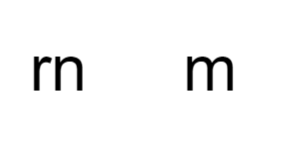
Can you tell the difference between the letters on the left and the letter on the right in this image? On small screens, small gaps may become invisible.
In typography, a font’s kerning refers to the space it employs between two characters. Within a font, different characters may be kerned differently, and designers often do this to avoid misreading.
Tracking refers to the spacing of all the characters across a line of text and accounts for these differences in spacing between letter sets. Monospaced fonts do not distinguish between characters when defining the space between them.
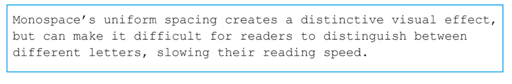
Monospace’s uniform spacing creates a distinctive visual effect but can make it difficult for readers to distinguish between different letters, slowing their reading speed.
Strokes, stresses, stems, bowls, shoulders, and other character anatomy: Typographers use different terms to describe each part of a character. For example, a stroke is a linear mark, while a bar is horizontal. Bowls, shoulders, and loops describe curved elements.
The styling of these and other parts of a font’s characters will have a significant impact on how the font is perceived emotionally by the viewer and its readability and legibility.
The general shape of each letter–whether it is angular or rounded, how the different parts are joined, whether the strokes vary in width from thick to thin, the character’s overall thickness, and other character anatomy attributes are all relevant to the effectiveness of a particular email font.
📧 Knit Picks employs several fonts with both thick and thin profiles to give their promotional newsletter a catalog-like look.

Character contrast: While it’s expected that the glyphs in a font-family share some similarities, a lack of contrast between characters can make them difficult to read.
In some fonts, characters such as lowercase letters “d” and “b” are mirrors of one another–the shape is the same but is flipped vertically or horizontally to represent a separate character. In others, the lowercase letter “l”, the number “1” and the uppercase letter “I” all appear the same.
This lack of differentiation or character contrast can cause confusion for readers and force them to look for contextual clues to decipher your copy’s meaning.
Font size: The points or font size of the copy in your message will impact not only its readability and legibility but also its usability. Can your subscribers see your copy and click on your CTAs and other links? Tiny font sizes make these activities difficult!
What is the best font size for emails?
The best font size for an email newsletter is between 13 and 22 pixels, or 10 and 16 points.
To ensure your CTAs are accessible for mobile users, make your copy at least 16 pixels or 12 points.
This range offers you a lot of room to use different font types, weights, and sizes to develop your email’s visual hierarchy. Test your font’s appearance on both desktop and mobile devices before committing to a size and make sure you adjust your line spacing to accommodate your font sizes.
Consider the other characteristics of your selected font when choosing its default display size. A script or cursive font will be more difficult to read in smaller sizes than a simpler, san serif font.
📝 Check out the article, Font accessibility and readability: the basics, and the guidelines at W3C’s Web Accessibility Initiative for more tips to ensure that your content is accessible to all your subscribers.
How to select the best fonts for your business’s email newsletters and promotional campaigns?

Ensuring that your copy will render properly and your subscribers can read the results is critical to your font selection process and can’t be overlooked. However, if these functional aspects were all that mattered, we wouldn’t need to write this article.
Everyone would just send their messages in plain text and let the system make the selection for them.
So why do we marketers spend so much time on font selection?
Because of what the appearance of your copy represents in the eye of the beholder.
Use the following tips to select the best fonts for your email campaigns.
Choose fonts that reflect your brand’s personality and style
Businesses invest significant time and money into creating an identity and conceptualizing their brand logo is often a pivotal part of that process. In fact, businesses sometimes consider how their brand’s moniker will appear in type before they pick a name.
According to Coca-Cola Australia, the original creator of the Coke formula selected its name because “the two Cs would look well in advertising.” He then designed the instantly recognizable Spencerian script used in the brand’s logo.
Later, the company added a slab sans serif font to the branding strategy, but the original script carries on with only a few modifications.
The downloadable font from Font Meme displayed in the copy below emulates the Coca-Cola logo’s signature style.

Compare how the same copy appears when a modern sans serif font is applied.

The parts of a character affect its legibility and the emotional or psychological response it generates. Some of this response is nature and some nurture. By that I mean that we naturally perceive and respond differently to sharp versus rounded edges and other visual cues.
But we also associate meanings to different fonts based on historical applications and cultural teachings.
For instance, we associate font styles that resemble the type used by analog printing presses and typewriters with tradition and old technology. In contrast, fonts that look like the ones used for modern computer displays are more likely to be associated with innovation and contemporary ideas.
📧 Consider the two email examples below, each from a different brand.
The fonts in GlassesUSA’s email contribute to the message’s fresh, modern feel. Meanwhile, Joss & Main conveys elegance and design expertise with more traditional font selections.

Fonts that resemble handwriting or script may appear very formal or very casual depending on the type of handwriting they emulate. Because of their associative meanings, these general classifications are a good starting point for choosing your fonts.
An entire class of fonts is associated with children or products and services marketed to children because of their association with child-like handwriting.
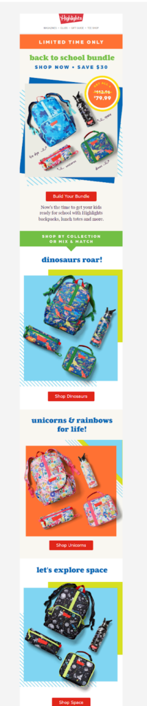
📧 Pictured below, child’s clothing retailer Ten Little uses a rounded sans serif font to convey a sense of youth. Meanwhile, Highlights for Children goes with a chunky style to communicate its appeal.

Use font classifications or types and their associations to narrow your selection
Fonts may be classified by their style or by the historical time period with which they are associated, and a single font may hold more than one classification. For example, Courier New is a monotype serif font. Impact is a sans-serif display font.
If you’re ready for a deep dive into fontology, Fonts.com offers a detailed classification system with 15 styles modeled after the 1954 Vox system to help designers narrow their selection process. Most of us will stick with something simpler, dividing our fonts into four to six categories.
In a four-class system, fonts are categorized as:
- Serif
- Sans serif
- Script
- Display
A six-class system includes
- Serif
- Slab serif
- Sans serif
- Script
- Handwritten
- Decorative or fantasy
Here’s what these typography classifications mean.
Serif
A serif font is one that has extra shapes or lines attached to the end of a stroke. These accents are not necessary for the formation of the character and are merely decorative.
Within the serif category, fonts are further classified by other attributes such as whether thin and thick strokes appear in a single character, and whether the serif is bracketed or ends in a rounded (ball) terminal stroke.
📧 Serif styles are popular with publishers in consulting and news-adjacent fields, like The Information’s “The Briefing” newsletter because of its ties to traditional news and magazine publishing.
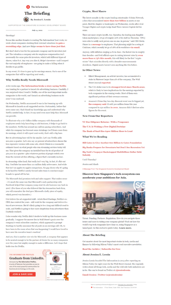
Changes in font can help businesses distinguish between sections of a newsletter or between native or other third-party ads and the publisher’s content in an email.
Slab serif
Slab serif fonts are a subset of the serif classification that is characterized by heavy serifs that are similar in weight (width of the stroke) to the character’s stroke or stem, and have limited or no bracketing.
Bracketing, btw, is a term used to describe how the serif attaches to the character’s stroke. If the attachment point is rounded or curved, the serif is bracketed. If the attachment is placed at an exact or near 90-degree angle, it is not bracketed (a.k.a. slab).
Rockwell (pictured on the left) is a slab serif font. Book Antiqua (on the right) is a bracketed serif font.
San serif
Sans serif fonts are… you guessed it, typefaces in which the characters are not accented by serifs. “Sans” here references the French word meaning without.
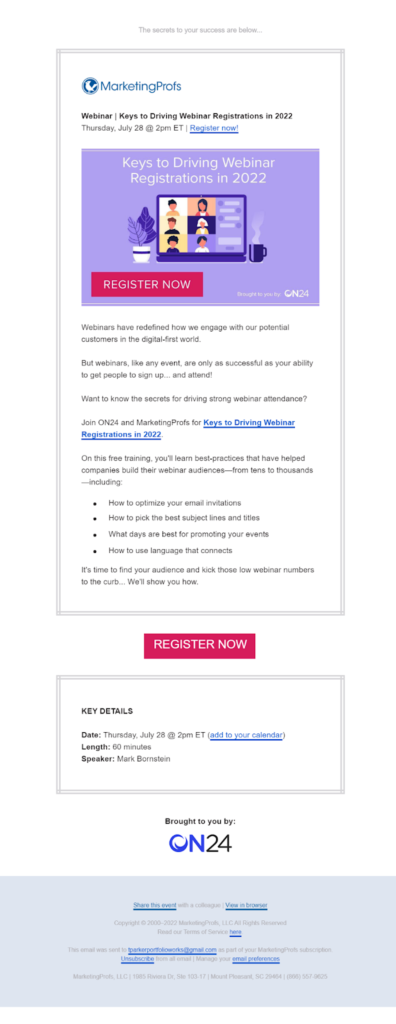
📧 MarketingProfs goes for a modern look with a sans serif font in its webinar invite email.
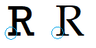
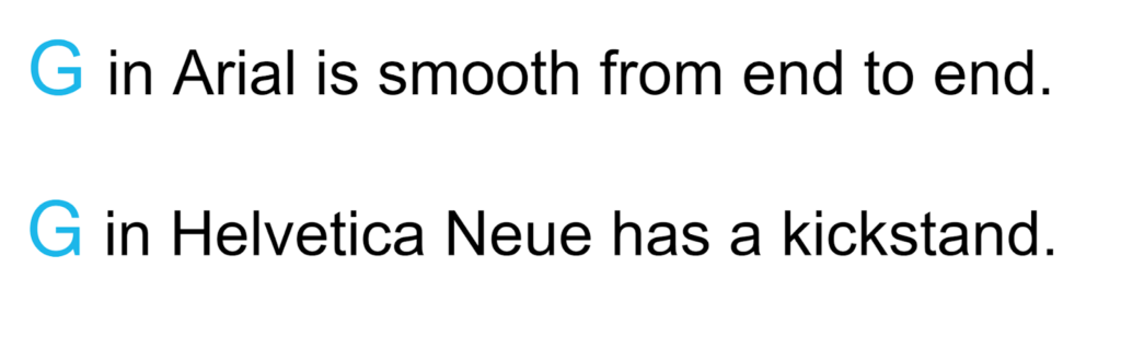
Note: A san serif font’s characters may have some extra lines that a non-designer like me might mistake for serifs. For example, the capital Helvetica Neue G has a little kickstand. But that’s not the same as a full serif.
Script
Script fonts may resemble calligraphy, cursive or handwriting. The letterforms and characters of script fonts will incorporate curves, loops, flourishes or strokes that vary in thickness and aren’t perfectly straight or evenly curved or angled.
Coca-Cola’s logo uses an old-style script font.
Handwriting
Handwriting in the six-class system is a separate or sub-category of script representing fonts that introduce uneven strokes or other characteristics of hand printing.
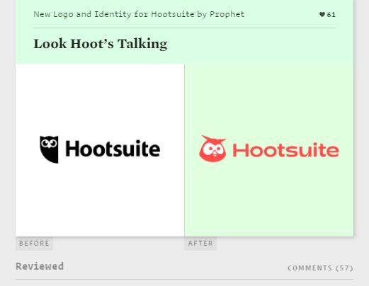
📧 Hootsuite’s updated logo font is an example of a modern font that uses thick and thin strokes to add just the hint of a handwritten vibe.
Display
Display fonts get their name from their original purpose as the fonts used in UI or screen displays. These fonts are often thick and chunky making them ill-suited for paragraphs but perfect for headings and CTAs.
Decorative or fantasy
This catchall category includes fonts that are unlikely to appear in long blocks of copy. These fonts are unusual and often include extra flourishes, uneven heights and stroke weights between and within characters and have other attributes that make them stand out from the usual mix of fonts.
Wingdings is a classic example of a fantasy font–unreadable but fun.
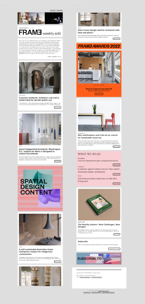
📧 The newsletter examples below from design industry publisher Frame includes bold display fonts and decorative font highlighting its 2022 awards announcement.
The site Material.io is an excellent resource for learning more about these font classifications and to locate fonts from each category.
Select the combination of fonts for each email message to support your objectives and deliver a positive subscriber experience
Choose font styles suitable for your message’s tone and visual hierarchy. The fonts you choose for your emails should not only be workable for the channel and your brand but also for the specific email message.
Use a combination of fonts that complement one another and support your message design.
Your typographic hierarchy should help readers understand the order in which your content should be read and the relationship between different sections.
For example, your heading fonts should attract more attention than your body fonts. While you should place the greatest emphasis on readability when selecting the fonts for the body copy.
Support your branding with your font selections through consistent use of a few select fonts for each type of email you send, such as newsletter and transactional messages.
Make sure you match your fonts to your message’s tone. Don’t select an irreverent font like Comic Sans to deliver news of a security breach!
Test your newsletter and other email font choices to make data-backed choices
Begin your search for your new best fonts by using these guidelines to narrow down your font selections to a few top contenders for each of your needs, such as headings, body text, CTAs, and other parts of your emails. Then, conduct type studies to compare and evaluate your favorites and pick your winners.
Use A/B testing to evaluate different font and font combinations for use in different email types and subscriber segments.
Once you’ve selected and assigned your fonts across your various email templates, make a note of your choices in your style guide. Continue to monitor the performance of your fonts and adjust your selections (and style guide) as needed.
Looking for more methods to create high-style, on-brand email messages? Take a look at our top tools for email round-up, Email Marketing Tools To Drive Your 2022. It’s chock-full of tools to make your path to email success smoother.


 Academy