

Is your call to action such a big deal? Because an effective email marketing campaign should motivate your subscribers to act from copy and text alone. Right? Here’s the thing, a compelling call-to-action is the last push-out-of-the-door that guides readers seamlessly from desire to deed. You know what you want. In this guide, you’ll learn how to ask for it the right way.
Have you ever worked with someone whose idea of management was to tell you where to go and what to do without offering any support?
Or worse, a manager who gave you no information and expected you to figure everything out on your own.
Neither of these styles is particularly inspiring, amiright?
Most people don’t like being told what to do. They prefer to feel like they’ve made a choice to act. On the other hand, if you give someone no instructions, they may choose to do nothing.
A good manager understands these quirks of human nature. They know that inspiring others to take action rather than command it is the way to go.
“If you want to build a ship, don’t drum up the men to gather wood, divide the work, and give orders. Instead, teach them to yearn for the vast and endless sea.” -Antoine de Saint—Exupery
What does this have to do with your email call-to-actions?
Everything.
The traits of the human condition affect how people respond to your marketing emails, too. And If they are motivated to perform that action intrinsically or extrinsically affects:
- If they’ll perform any action at all.
- How they’ll feel about it.
- And how they’ll feel about you in the future.
More about that in the guide below.
Call-to-actions (CTAs) are a critical component of a successful email marketing campaign. These buttons, images, texts, or entire conversations even are your conversion portal, linking your subscribers to the next step in the funnel.
If you’re relying on short, command-style instructions to convert your subscribers to customers like “Buy Now,” “Click Here,” “Shop Today,” you might need to rethink after you read this.
Of course, it’s better than not giving them any guidance at all.
Your email call to action can be a vital engine for driving clicks conversions, boosting engagement, and raising revenue.
If done correctly, of course.
What does it take to transform your email CTAs from basic to motivating?

Our guide below will take you through every step of the journey.
Lead your subscribers to conversions with carefully crafted call-to-action
While every email campaign consists of many different elements–each of which is important to its success–your call to action is what transforms monologs into dialogs.
Despite its importance, though, email marketers often treat CTAs as an afterthought.
Instead of carefully calibrating their CTAs to maximize subscriber engagement and motivate action, they stick to the simple and familiar or choose something templated because they don’t trust their gut.
Don’t get me wrong. Those basic CTAs can get the job done–sometimes.
If your subscribers are sufficiently intrigued by your email’s other elements or are highly engaged and just need an easy way to click through to your website, a “Download now” or “Shop” button will work.
But you’re here to learn how to shake off those mediocre results and get those outstanding ones, right?
A well-crafted CTA is an element of persuasion that can build rapport, emphasize value, engage and entertain, inject urgency, offer affirmation, or explain to your subscribers what’s in it for them.
How many click-throughs and conversions are you missing out on when you don’t give your CTA attention?
Let’s fix that and find out (we’d love to hear about your results in the comments).

Start with a strategy built on maximizing conversions
Creating a call-to-action that leads the way and not just pointing to the nearest landing page requires shifting to a `conversion-focused mindset’.
Prioritize conversions by defining your objectives and the conversion events to achieve them during the planning stage of your campaign. If your email campaign has more than one objective, then you’ll need to complete this process for each one.
| Objective | Conversion event |
| What do I want to achieve with this email? | What do I need my subscribers to do (and feel) to achieve this objective? |
| Examples: Increase orders for a specific product. Gain customer referrals. Generate visits to a landing page. | Examples: Go to the product page and place an order. Send a referral code to a friend. Click-through to a landing page. |
Once you have clarified the purpose of your campaign and the subscriber action that signals success, develop your call to action.
This may seem backward. After all, it would help if you got subscribers to open and read your emails before responding to the CTA. But, to maximize conversions, everything from the subject line to the point-of-click must lead toward your CTA.
You can’t plot an accurate path until you know where you are going.
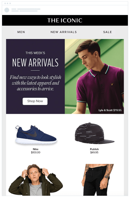
In this welcome email from Bonobos, the brand’s objective is to move people from subscribers to customers by getting them to make their first purchase with the brand.
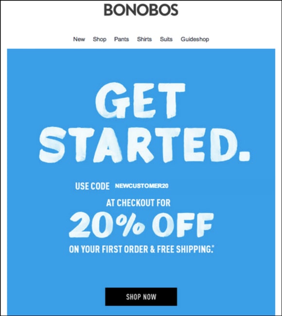
The language is simple and delivers the brand’s message clearly. However, the email’s generic “Shop Now” CTA can provide a more exciting promise.
A made-to-match email call-to-action could take this further:
- “Let’s go shopping!”
- “Yes! I want 20% plus free shipping!”
- “I’m ready to start saving with Bonobos”
Of course, straying from the tried and true comes with some risks.
Basic CTAs are easily recognizable for what they are. They are serviceable and don’t make your subscribers think too hard about where to click.
When you create emails that hinge on a customized CTA, your copy and design must do their part to highlight and clarify your CTA. Mastering this effect may take a few tests.
Nonetheless, I encourage you to give it a try. Because, as the saying goes, “Nothing ventured, nothing gained.”
Your short, simple CTAs may be working, but are they working hard enough?
Remember, your call to action is your email’s last bastion of revenue and subscriber base increase.
Does every email sent by your brand need to include a CTA?
Before I answer that question, let me point out that CTAs come in many different formats and styles. You might not think of some as CTAs, but they still facilitate conversions.
I already mentioned basic CTAs that consist of simple directions or commands such as:
- Download the report.
- Shop now.
- Click here.
And I contrasted them with detailed CTAs that are directly related to the content and goal of your email. CTAs such as:
- Download this report to discover what top experts predict for 2021.
- Explore our fall collection today.
- Discover your next favorite song.
These CTAs can be presented as buttons, graphics, linked text, or some combination of elements.
But, these two CTA types aren’t the only way to lead subscribers to the next step in your funnel.
Many emails have links intended to channel subscribers to a specific destination, but the text doesn’t state a call to action.
These implied or non-CTAs text links communicate their purpose through positioning, surrounding content, or formatting cues.
Take a look at this newsletter from Hiten Shah.
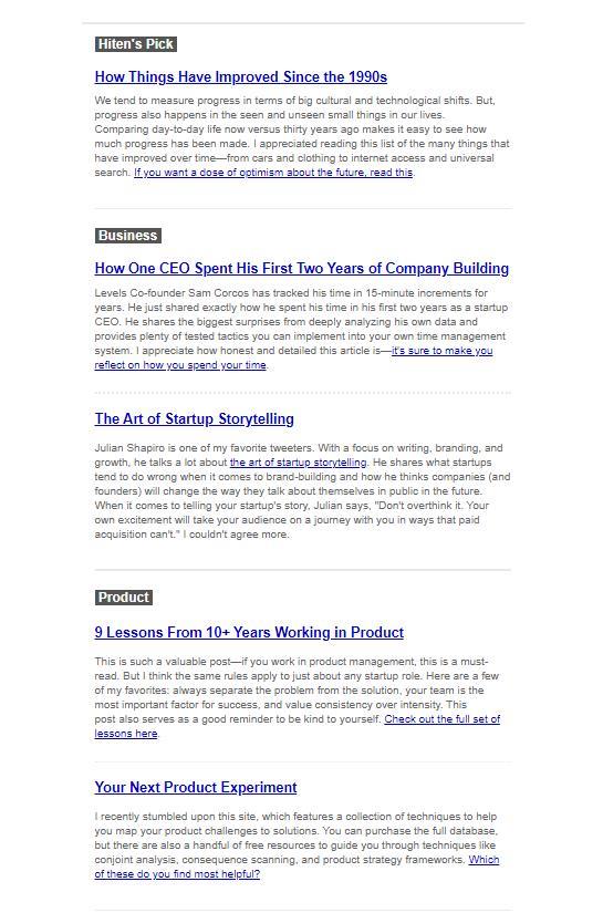
The title of each featured article includes a link to the full text. Shah is trusting that his readers know what to do. Just in case someone misses the clues, he also adds a direct text-based CTA to most of the articles.
Newsletters and other text-heavy messages frequently include this type of linked copy to help users navigate their next steps.
Images and graphics can also be used to direct a customer to your desired destination without overtly revealing themselves as a call to action.
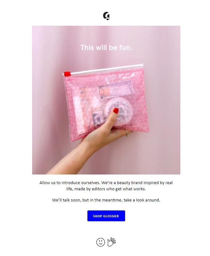
Glossier’s welcome email has a prominent CTA button. But that’s not the only click-through-point that will allow you to start shopping. Click on the hero image, smiley face, or hand, and you’ll also end up on the main product page.
Finally, your emails may include multiple click-through-points that aren’t related to the campaign objectives, such as a link to your homepage in your brand’s logo.
When planning your strategy, take all of these different channels to your website into account. The presence of links to conversion and non-conversion locations will affect how subscribers engage with your emails and your CTA’s performance.
Now, back to the question at hand.
Is there ever a time when a brand should send an email without a CTA? After all, CTAs can be perceived as pushy. Maybe that’s a good reason to limit how often you use them?
My colleagues and I discussed this very topic when we wrote this article.
After some debate, we concluded that you should omit a CTA (of any kind) from your emails only if including one won’t add value or advance your objectives, or you are prohibited by law.
That’s a good rule of thumb to launch any testing from.
In most cases, the solution to avoiding being too pushy is to choose the right kind of CTA to use.
Every email is an opportunity to engage with your subscriber, deepen your relationship and move them forward. A well-placed CTA is your best chance to seize that opportunity.
If a bottom-of-funnel CTA doesn’t fit, use your CTAs to promote top- and middle-of-funnel objectives such as building brand awareness, enhancing customers’ experiences, or sharing useful information.
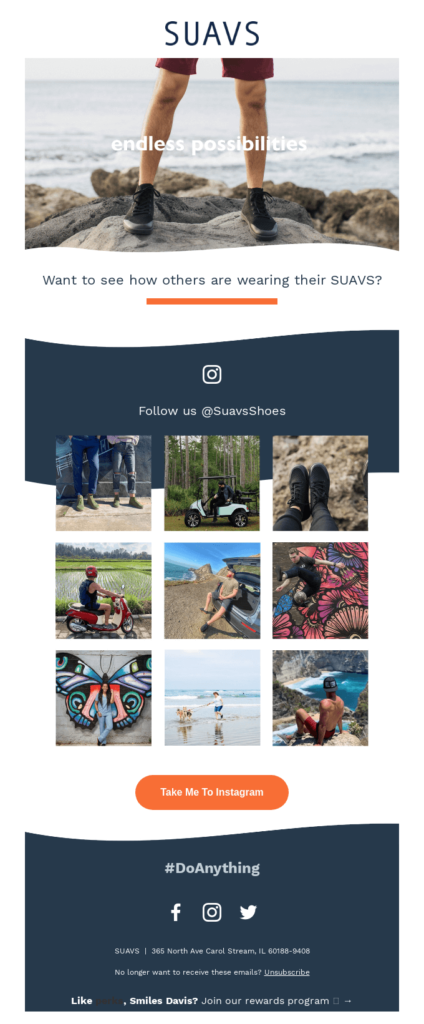
Community building and social media engagement are the objectives of this email, featuring user-generated content from shoe brand SUAVS.
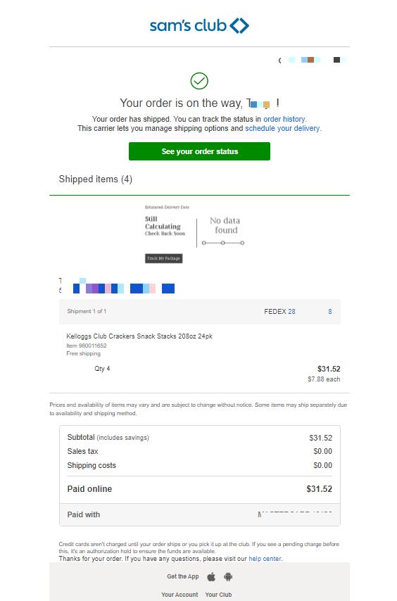
This transactional email from Sam’s Club adds value and enhances the customer’s experiences by including a CTA directing them to a personalized delivery tracking page.
Just make sure you only add CTAs when you have permission to do so.
When can’t you include a CTA?
In The Ins and Outs of Transactional Emails, we wrote about the benefits of including promotional elements in your transactional emails. Transactional emails have fantastic engagement rates, making them a prime place to include a call to action.
However, including promotional messages in transactional emails isn’t always permitted.
- Some jurisdictions allow promotional content in transactional emails. You can add a CTA inviting your customer to explore new deals or shop again to their order confirmation or ask them to explore your job coaching services after they’ve applied for a job using your website without fear.
- For instance, in the EU and Canada, adding any promotional messages to your transactional ones without the subscriber’s consent is prohibited.
In these jurisdictions, you’ll need to make sure any CTAs in your transactional emails are value-adding only, not promotional.
Decide how many CTAs your email will include
Choosing Choosing how many CTAs to include in each email involves practical and design considerations.
The answer you reach will depend on factors including how many objections or conversions events you selected for the campaign, how long the email is and its design, and how narrowly focused your targeting for the campaign is.
How many CTAs do marketers usually include in their emails? According to a survey by databox:
- 43% use just one.
- 30% have two.
- 20% use three or more.
Using too few CTAs can cause you to miss potential conversions. And, if you’ve chosen multiple objectives for your email, then you’ll need CTAs to match. On the other hand, using several CTAs can reduce their effectiveness. Your CTAs may compete against each other for attention, diluting your ability to leave an impact and introducing click motivation into the equation.
Finally, keep in mind that CTAs are designed to interrupt the flow of your email message and ask the reader to take action. This means that if the CTA is successful, you get your conversion. If it isn’t, you’ve merely stopped your reader’s progress.
So, what are your options?
One objective, one action, one call
Many email marketing experts recommend that your email messages include one CTA focused on achieving a single goal.
Executing this strategy takes commitment, though. Instead of crafting a one-size-fits-many email with offers, backup offers, and not-ready-to-buy alternatives, you must choose one focused message.
You only have one shot at conversion with a single CTA. Your email message must be custom-tailored for your target audience and centered on your desired action.
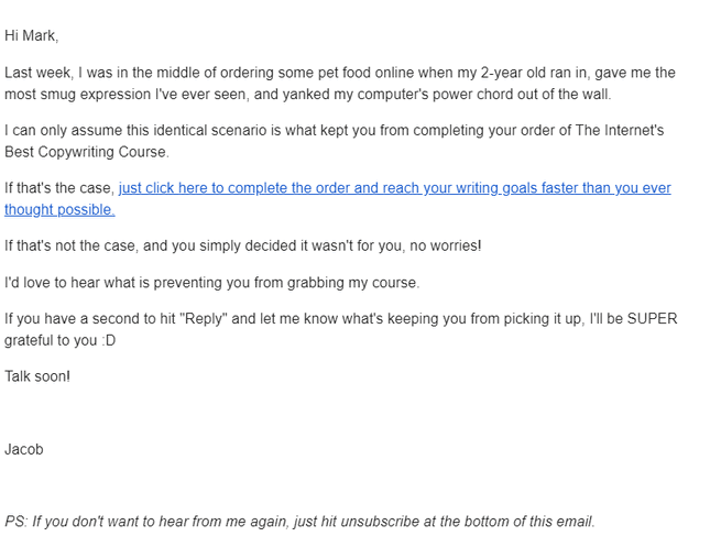
Jacob McMillan doesn’t distract in his cart abandonment email with a text CTA that explains how and why to complete the transaction.
One email, one or more actions, multiple CTAs
We’ve all seen emails with multiple CTAs. Is there a way to do it right?
Yes. There are several instances where incorporating multiple CTAs into your email message is the right move, including the following:
- Say it again for the folks in the back. Including more than one CTA in your email is less likely to dilute your message if the CTAs all lead to the same endpoint.
Using more than one same-destination CTA allows you to include both text and button CTA formats in the same message. This is good for accessibility and visibility.
CTAs with the same endpoint but different copy enables you to try several appeals in the same message.
LogicMonitor includes a two-section copy and one button CTA in this invitation to register for its upcoming webinar. Each one approaches readers differently.
The first CTA tells readers what they’ll see, the second what to do, and the third addresses potential scheduling objections.

- Take a second swing with secondary CTAs. Another method of including more than one CTA within an email is the use of a secondary CTA.
There may also be instances you want to give your subscribers an alternate choice in case your objective fails. Secondary CTAs are your backup plan.
Secondary CTAs are useful when getting some reaction from your audience is better than nothing.
For example, if your subscriber isn’t ready to make a purchase, you might convince them to follow you on social media with a secondary CTA.
These secondary CTAs shouldn’t usurp the primary CTA but complement it.
In the example below, Zoёs Kitchen includes a primary CTA aimed at convincing people to place a food order. A secondary CTA invites those readers to learn more about how the brand handles safety issues. This CTA supports the primary by helping overcome a potential objection.
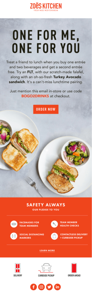
You may have noticed that while Zoёs Kitchen has two obvious CTAs, the email includes additional links to the brand’s web and social media pages.
This is another common multiple-destination strategy. In fact, some emails are almost entirely clickable. Pay close attention to your copy and design if you use a click-anywhere strategy, so your CTAs aren’t lost in the mix.
- Let your subscribers choose their own endings. One method common among effective leaders is that they give people the tools they need to succeed then step back to give them room to flourish.
That can be a winning strategy for earning conversions as well. There are times when more than one action will fulfill your email’s objective. In these instances, hand over the controls to your subscribers.
Build an email with multiple CTAs that lead to different destinations. This strategy gains readers’ investment in their journeys and increases engagement.
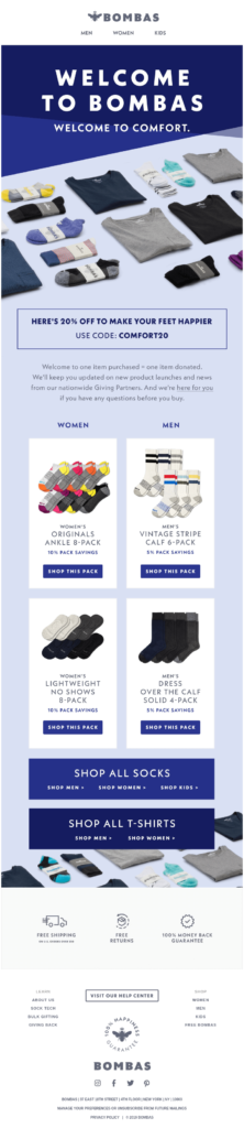
In its welcome email, Bombas helps new subscribers avoid site navigation headaches with a selection of CTA destinations.
Multiple-destination CTAs in a bottom-of-funnel email enable subscribers to reach their favorite products fast.
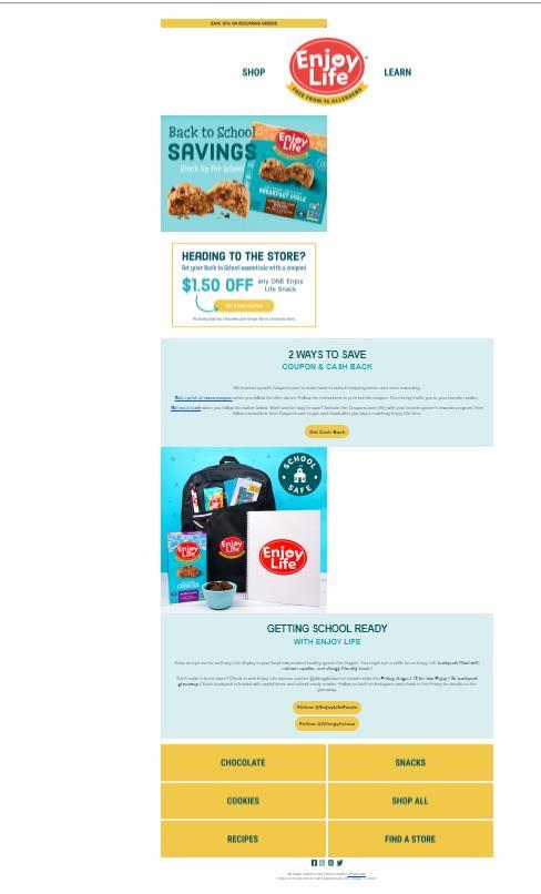
The main offer in this Enjoy Life email sent to active customers is an in-store coupon. The email also includes links to the top departments of the online store so online shoppers familiar with the brand’s products can skip the home page.
- Make taking action easy. Whether your strategy calls for a single-destination CTA or a choice of endings, your click-through points should always be within easy reach.
Something as simple as having to scroll up or down to click a link might cause your subscribers to abandon their path.
For a short email message, one CTA may do. But, for a longer message, your CTAs should be strategically placed throughout your email message to ensure that your subscribers have no reason to hesitate once they’ve decided to take action.
For subscribers who want to act fast, placing your first CTA above the fold (or scroll) will make it accessible as soon as your email is opened.
Place your other CTAs at regular intervals throughout your email near the copy or images they relate to so you can catch your readers at the moment of decision.
There’s always a click-through point nearby in the lengthy email from Life Line Screening below. Button-style CTAs and text links are distributed throughout the message.
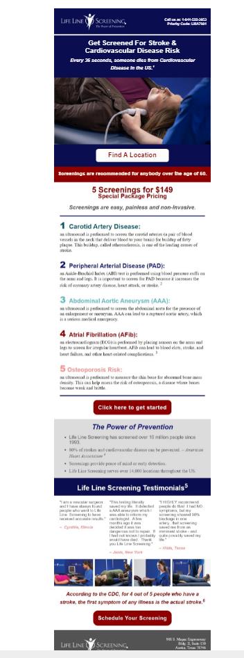
To maximize the chances of conversion, the copy on each primary CTA button is different. Then, the central panel includes secondary implied CTAs that link readers to more resources.
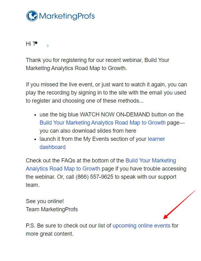
Want to catch those subscribers who scroll to the very bottom of your message? Try placing a CTA at the end as a P.S.
What’s the bottom line?
Offering your subscribers alternatives by including multiple-destination CTAs in your emails may help you gain more conversions or build engagement with subscribers who aren’t ready to commit.
However, a catch-all strategy that doesn’t add value won’t impress today’s sophisticated email consumer.
Now, let’s look at some copywriting tips for an email call to action that shines.
Write some out-of-this-world copy
Influential leaders are good communicators who use a combination of methods to win over their audiences. Through storytelling, incentivization, authenticity, clarity, and persuasion, they make what they say and how they say it counts.
You have to rely on copywriting and guts to get your points across in email marketing. Your story needs to move readers to the next phase in their journey, and the expertise to weave a call to action into your email makes a world of difference.
It needs to feel natural to go through with the click.
Copy is an art, and it takes many years to refine. But these rules apply to all levels of copywriting and will serve as an excellent skeleton to any email you create:
- Start the way you plan to finish. The process of compelling your subscribers to act begins with a subject line and preheader that grab attention.
The subject line and preheader set the tone for your email and start your subscribers’ journeys toward your desired destination. Don’t lead your subscribers astray at the first step. Make sure the promises made by your pre-opening copy match what readers will find inside and expect at the end.
- Coordinate your email copy with your CTA to maximize its potential. Your CTA can say a lot, but it can’t tell your entire story alone. Leverage all of your email’s content to guide your readers.
Check out how Brooks Running Shoes leads its subscribers to action with a compelling story in this inventory alert email.
Using a theme of scarcity, the email’s objective is to get recipients to subscribe for inventory updates.
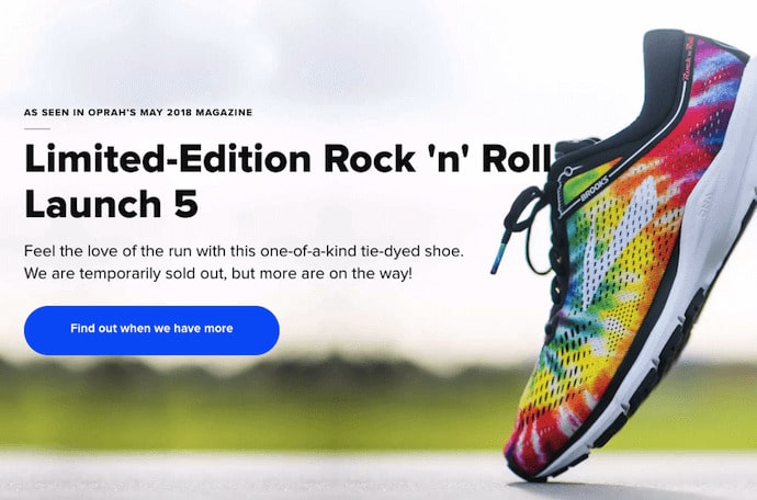
Following the classic problem-solution format, the email tells subscribers that the “limited-edition” shoes are sold out. The email’s CTA offers readers a solution to the shortage, “Find out when we have more.”
The copy nearest your CTAs is a prime location to add data that justifies the desired action and overcome objections.
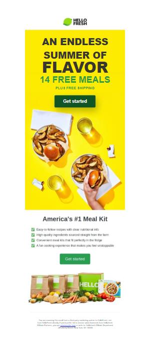
The free shipping promise placed directly above the primary CTA in this email Hello Fresh email gives subscribers a little extra incentive to take the next step.
- Choose progressive milestones that make sense for your audience. When you have a specific objective in mind, it can be tempting to rush your subscribers to reach it. But, trying to skip steps in the buyer’s journey can cause you to lose more than you gain.
Lead your readers toward your goal at a reasonable pace so no one gets left behind. Create email campaigns that reflect and respect where your subscribers are in the funnel, and use CTAs to match.
For example, if your subscriber doesn’t have enough information to make a decision, pressing them to act may drive them away.
Save your “buy now” CTA for your high-engagement repeat purchasers who will be happy to shop your latest sale. A “learn more about our products” CTA is more appropriate for an awareness stage subscriber who has no previous interactions with your brand.
- Make your meaning clear. I love a good contextual CTA like this one from Missa.
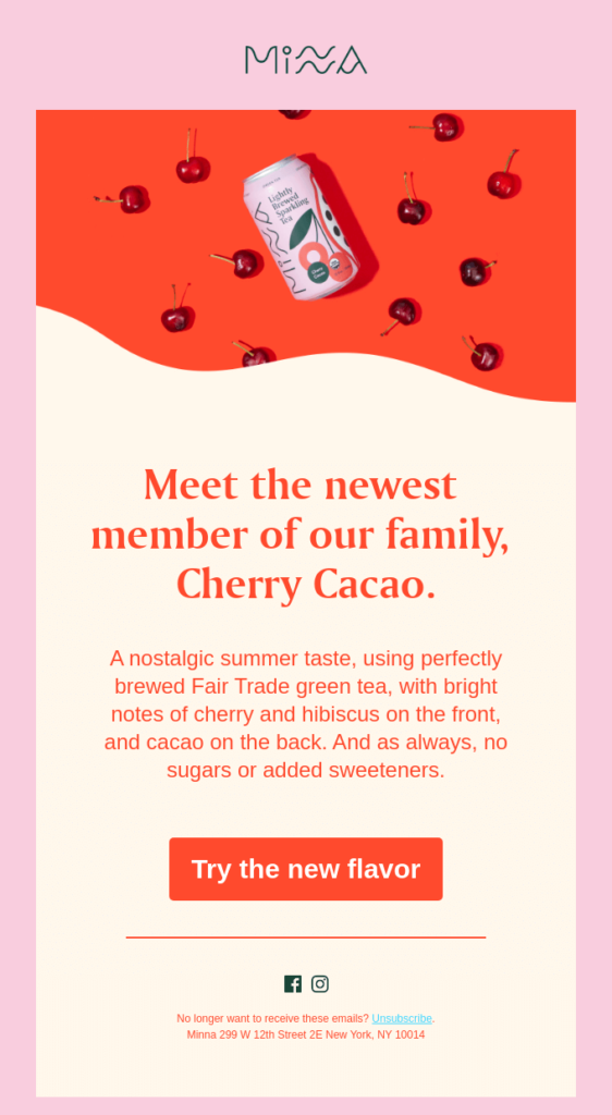
The CTA adds just the right note to the brand’s cheery, engaging message. The surrounding copy and graphics make the meaning of “Try the new flavor” clear.
When you use an out-of-the-ordinary CTA, these types of contextual cues are crucial. You don’t want to be so clever that your audience doesn’t get it.
- Make sure your readers get what they expect after they click. I received a promotional email about a new industry report a few weeks ago. Since I wanted to stay up to date, I clicked on the “Download Now” CTA.
But the report didn’t start to download or open on a new Chrome tab. Instead, I arrived at a landing page with a form I had to complete.
Invested, I completed the form and clicked the submit button. In this instance, the journey ended with the report in my hands. At other times, I had the misfortune to be routed to thank you page that tells me to check my inbox.
When that email arrives, it says, “Download Now.” 🤦♀️
The more steps your subscriber has to take after clicking to reach the promised outcome, the less credibility you have.
Equally important, each additional step is a point of friction that may cause subscribers to abandon the process you worked so hard to get them to start!
For multi-step conversion, processes aim for accuracy and don’t overpromise.
Use a CTA such as “Get your copy of the report” or “Order your free report today” to get the process started.
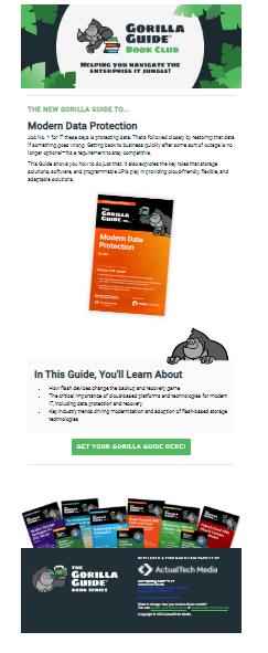
Gorilla Guide gets it right with their new book release email. Clicking the “Get Your Gorilla Guide Here!” CTA takes you straight to the promised pdf.
- Place your reader in the center of the action. Engaging directly with your readers is an effective attention-getting technique, and power words get that name for a reason. Combine these two persuasive strategies for a CTA primed for action.
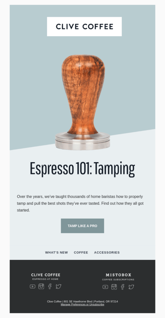
Clive Coffee’s new course invitation packs a lot of action into its short CTA.
Also, the best action-oriented phrases entice your readers to move without making it seem like work.
Try using “Sign me up,” “Save my seat,” or “I’m there!” instead of “Register now” in your next webinar invitation email.
Entice your readers to visit your eCommerce site with a “Take me shopping,” “Show me the new collection,” or “Yes! I’m ready for something new!” button.
Even better, use automation to do the work for your subscribers. If you have their email, use that information to autofill registration or sign-up forms after they’ve clicked through.
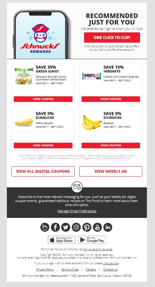
This email from Schnucks makes saving money almost effortless with a “One-click to clip!” CTA.
- Tell readers what’s in it for them. This strategy is always a winner and can be used in your email’s copy, CTA, or both.
MIT Sloan Management Review doesn’t beat around the bush when getting readers to complete its survey. The can’t-miss CTA promises participants a chance to win a free iPad.
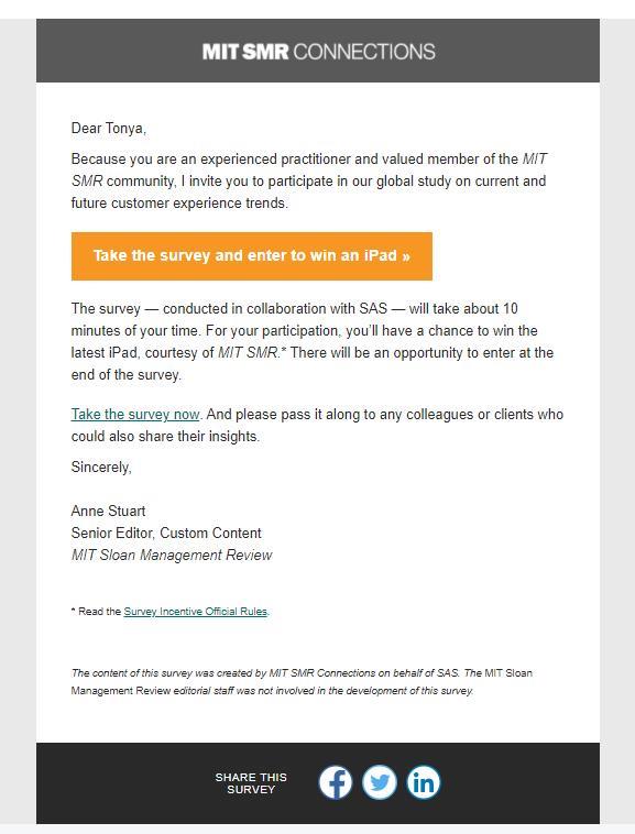
The copy below the CTA supports the email’s goal with an objection-busting disclosure of how long the survey will take to complete.
- Once more. With feeling. I briefly mentioned intrinsic and extrinsic motivations earlier in the article. Both serve to guide subscribers into conversion, but it’s vital to understand how they approach it.
The example above from MIT can be categorized as a promotion that leans on extrinsic motivation. It offers subscribers a clear reward for specific behavior – a chance to win an iPad in return for their feedback.
To be clear, I’m not dismissing using extrinsic motivations and rewards as a way to get readers to convert. It has its place in the world.
But here’s the thing, extrinsic motivation is not as strong and long-lasting as intrinsic motivation.
When you connect with your subscribers, tapping into their deep pains and needs, this is when you form a real and meaningful connection with them. And the best part? They’ll appreciate you for it.
That’s because intrinsic motivation is defined as doing an activity for its inherent satisfaction rather than some separable consequence. How can you approach this with your copy? You may need to change your thinking process.
For example, if you offer a new course, maybe stating the discount or monetary value isn’t enough. Consider testing a copy that will emphasize the joy of learning, of getting new skills, or perhaps making a difference for yourself and in the world. Such inherent values may resonate more strongly with your users, leading to a boost in KPIs across the board because the reader will remember that, and you.
- Specificity is your ally when explaining the benefits of saying “yes” to your subscribers.
Grab an extra opportunity to capture scanning attention spans without reading all the details by including them in the CTA.
Use the CTA to name your discount, state the value, and answer the “why” question.
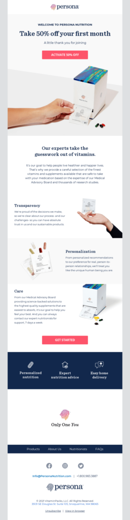
Persona levels up by using an action verb and naming the savings in the below above-the-fold CTA.
- Reinforce your marketing message with a coordination campaign across different media. Sometimes people need to hear a message more than once and from more than one source to become truly inspired. Fortunately, most people are consuming media from several channels.
Connecting your email campaign to a popular trend or your own brand’s marketing messages on other channels will strengthen its authority and influence.
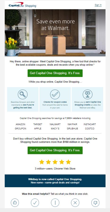
The CTA in this promotional email from Capital One is the tagline from the product’s video commercial starring Samuel L. Jackson. Can you ‘hear’ him urging subscribers to give it a try?
- Select the CTA that suits your audience. Your CTA should be custom-tailored to match your objective and your audience. As you develop your strategic plan, consider what type of nudge is most likely to move your target segment.
Evaluate each segment separately. Will the same appeal work with each of your planned audiences?
Using dynamic blocks and segmentation, you can create templates that allow you to modify your CTAs to match your audience personas, geographic locations, or other characteristics.
- Take your readers to a landing page built for incoming email traffic. Sending your email subscribers to your website’s homepage every time they respond to a CTA can get a little boring.
After you’ve built a great storyline in your email and convinced your readers to click, give them a follow-up chapter that makes them glad they did.
Not every campaign will merit its own custom landing page. You’ll see them most often connected with CTAs that invite subscribers to register for a webinar or download an ebook.
But that doesn’t mean you can’t make a unique page for other types of campaigns. Adding this final touch will give your subscribers the one-of-a-kind experience that makes a brand memorable.
- Don’t leave your most crucial email element incomplete. No matter how well you’ve crafted your CTA, a missing or misdirecting link will put an end to all your campaign plans. So, check your links, then check them again before you hit send.
Of course, great copy plays very well with great design, so continue reading.

Design an email experience that paves the way to higher conversions

Good design inspires and motivates people to click. Bad design inspires to do the same, just elsewhere.
Design is more than just your pretty colors and shapes. Your readers will expect content that downloads fast and is easy to navigate through.
How can you use design to make sure your call to action gets the attention it deserves?
- Decide whether you’ll use text, button-style CTAs, or a combination of styles. Consider your goals, your audience, the offer you’re making, and the devices that your subscribers are likely to use to view your email when choosing what types of CTAs to use.
Buttons have stand-out appeal. But text-only CTAs have their place, too.
A simple text email may appear less pushy, convey authenticity and inspire trust.
This webinar invites from Simple Media Group flips the script on button versus text CTAs. After kicking things off with an implied CTA, the email deploys its primary CTA using a text link. Then, the emails P.S. includes two secondary button CTAs promoting the brand’s other upcoming events.
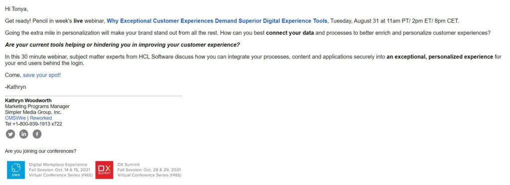
Does this email’s design inspire you to mix things up in your next campaign or leave you yawning? More importantly, would it inspire your subscribers to click?
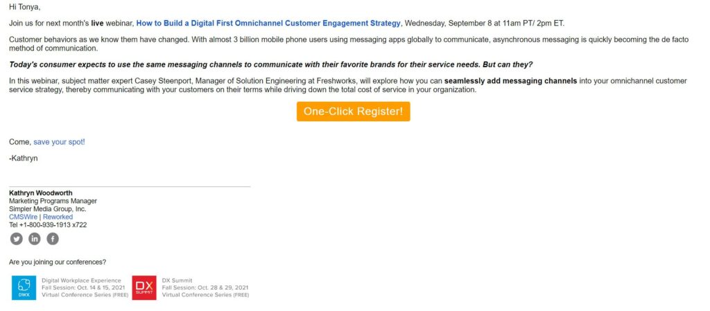
I suspect that Simple Media had that question as well. An invitation to another webinar employs a mid-email button to overcome objections and register attendees.
- Choose your color palette and how you’ll use it. Color can make both text and button CTAs pop. It can liven up your emails and draw your readers’ eye to where you want it to go.
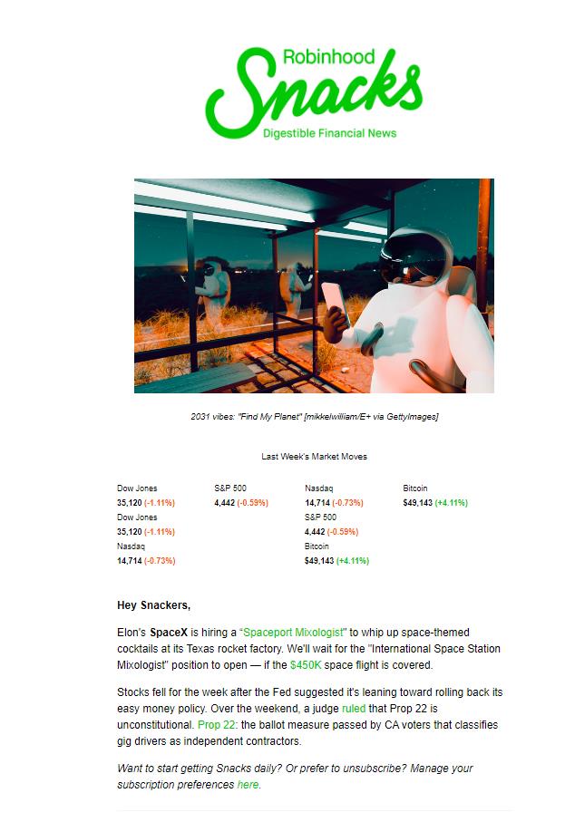
Robinhood sticks with its green color scheme to highlight linked text in its newsletter.
In contrast, Sallybux uses a color opposite to frame its primary CTA.
The brand uses color to differentiate its secondary CTAs from the surrounding text as well, but without stealing the spotlight from the prime target.
What color should your CTAs be?
Red and orange are popular choices because they communicate excitement. Other colors generate different emotions that can be equally effective, though. Check out this chart from OptinMonster:
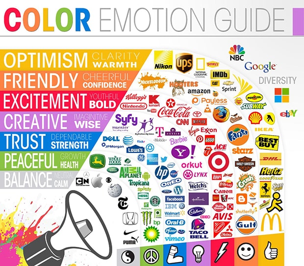
Look at your brand’s style, your subscriber demographics, and your industry to guide your color choices. Then test different colors and color combinations to see which ones drive the highest click-through rates for each of your list segments.
- Cut the clutter. Emails that lack whitespace are hard to read and make your CTA hard to find. Once you’ve developed your design, take a step back and look at it from a distance.
Does it look like a giant wall of text or images?
You might need to break things up if you want your CTA to succeed. CLEAR frames its colorful CTA with plenty of white space in this win-back campaign email.
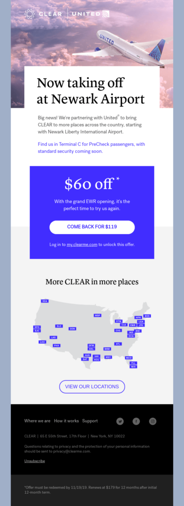
This brand hasn’t shied away from experimenting with color, either. The pinks and purples are a refreshing break from an inbox filled with red “Buy now!” buttons.
- Frilly fonts may not be your friend. If a CTA looks great but isn’t readable, its effectiveness is lost. Before you decide to use a font that’s extra-extra, test its readability across different devices.
Avoid fonts that appear overdone or cramped. Beautiful design should still be functional.
- Strike the right balance between clickable and clunky. Choosing how big to make your CTAs and where to place them involves considering both aesthetics and convenience.
Make your CTAs too small or close together, and they become difficult to click or tap. Make them too large, and readers may have trouble scrolling through your message without unintentionally hitting one.
Before signing off on your CTAs placement, test the UX on a mobile device to ensure it’s a winner for both form and function.
- Include accessible alternatives to graphics-based CTAs. When designing your emails, don’t forget that visually impaired subscribers prefer to use a screen reader, and they don’t download graphics.
Add alt-text and a text alternative whenever you include a graphic CTA in your email.
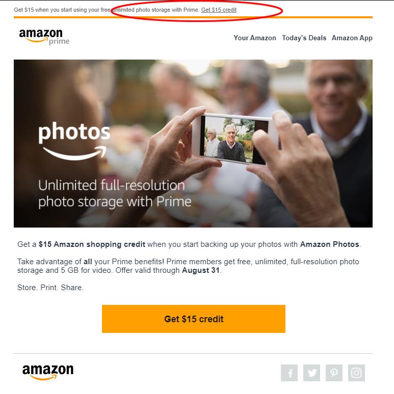
This email from Amazon promoting its new photo storage service includes a large graphic that tells a story. However, the brand reiterates that story using text.
There’s a text version of the CTA at the top of the message to ensure the CTA isn’t missed, even if the graphics are missing.
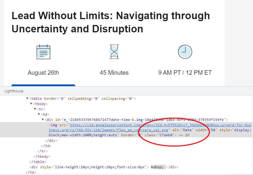
The email below uses symbols to represent essential data categories, including the upcoming webinar’s date, length, and time. Alt-text in the code ensures that the meaning isn’t lost when images are.
- To HTML or not to HTML? One of the risks of an email that incorporates lots of graphics is that the message gets lost if those images are blocked. If that message happens to be your CTA, well, you don’t have one anymore.
You can get around this problem by creating what many email marketers refer to as “bulletproof buttons.” These buttons aren’t made with images but with HTML code.
To make these bulletproof buttons, Email on Acid suggests inserting a table using HTML code that looks something like this:
<!-- START CENTERED BUTTON -->
<center>
<table width="100%">
<tr>
<td>
<table border="0" cellpadding="0" cellspacing="0">
<tr>
<td height="20" width="100%" style="font-size: 20px; line-height: 20px;">
</td>
</tr>
</table>
<table border="0" align="center" cellpadding="0" cellspacing="0" style="margin:0 auto;">
<tbody>
<tr>
<td align="center">
<table border="0" cellpadding="0" cellspacing="0" style="margin:0 auto;">
<tr>
<td align="center" bgcolor="#87be45" width="150" style="-moz-border-radius: 4px; -webkit-border-radius: 4px; border-radius: 4px;">
<a href= "http://www.example.com" style="padding: 10px;width:150px;display: block;text-decoration: none;border:0;text-align: center;font-weight: bold;font-size: 15px;font-family: sans-serif;color: #ffffff;background: #87be45;border: 1px solid #87be45;-moz-border-radius: 4px; -webkit-border-radius: 4px; border-radius: 4px;line-height:17px;"
class="button_link">
Get Started!
</a>
</td>
</tr>
</table>
</td>
</tr>
</tbody>
</table>
<table border="0" cellpadding="0" cellspacing="0">
<tr>
<td height="20" width="100%" style="font-size: 20px; line-height: 20px;">
</td>
</tr>
</table>
</td>
</tr>
</table>
</center>
<!-- END CENTERED BUTTON -->
You can find Mark Robbins’ instructions for making your links look like buttons on his website, Good Email Code.
<a href="https://example.com/" style="background: #333; border: 2px solid #f00; text-decoration: none; padding: 15px 25px; color: #fff; border-radius: 4px; display:inline-block; mso-padding-alt:0;text-underline-color:#333"><!--[if mso]><i style="letter-spacing: 25px;mso-font-width:-100%;mso-text-raise:30pt" hidden> </i><![endif]--><span style="mso-text-raise:15pt;">Link Text</span><!--[if mso]><i style="letter-spacing: 25px;mso-font-width:-100%" hidden> </i><![endif]--> </a>
Using code enables your CTA to survive the image purge. However, don’t forget to add alt-text for your other elements as well.
Want the code done for you? Give Buttonoptimizer.com a try. Use the design tool to create your button, then get the CSS code or download the PNG image for your CTA.
- Let your graphics point the way to your CTA. We use many different signals to help us find our way in the physical world. Signs, landmarks, and even arrows on the floor point us to where we should go and prevent us from getting lost.
Your email’s design and graphics are its wayfinders. The placement of your message’s text, images, icons, and other graphics significantly impacts where your subscribers look.
Some directional design techniques are apparent, such as putting a CTA button in the center of your email or using arrows or other elements to draw attention to it.
Other techniques are more subtle. For example, human beings tend to look toward what we see others looking at–even when images represent those others.
Placing your email’s CTA next to a picture of someone who appears to be looking at it gives your readers a nudge to do the same.
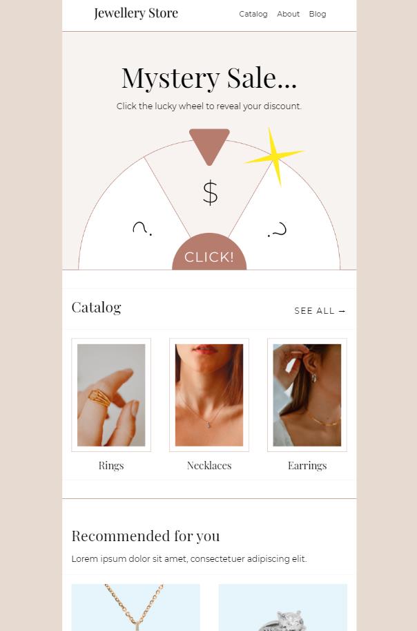
- Add an interactive element. Emails used to be a static form of communication, but no more. Now you can make your CTA come alive with graphics animations that invite your subscribers to interact with your message.
This template from BeeFree.io entices readers to click the wheel to discover how much they can save.
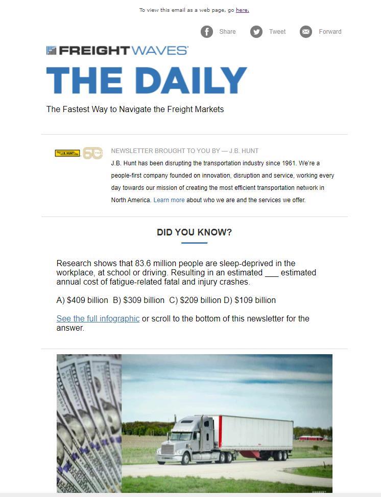
Design isn’t the only way to create interactive elements. Freightwaves uses a text-based quiz to induce readers to click through.
- Take one more look before you send your campaign. You’ve done this hundred (maybe thousands of times), and you’re sure the template is fine, right?
But is it?
Email service providers can change their policies, devices can render the same content differently, or someone might have messed with your code while you weren’t looking.
Why not give your email one last look before you ship it out to your subscriber list to make sure everything works?
Use your Ongage campaign configuration page to set up a test campaign to send your email to the email addresses you designate so you can view how your emails look across different devices. It will help make sure your images make the journey intact and confirm that each of your links is functioning as planned before you hit send.
Then, use apps like those recommended in Email Marketing Tools To Drive Your 2022 to preview your emails and check your URLs.
Use data-driven insights to develop even more powerful CTAs
You need more than good taste or intuition to optimize your emails for conversions. Leverage data at every phase in your email campaign’s lifecycle to create high-impact messages and higher CTRs.
Maintain a continuous cycle of data discovery and evaluation to keep your information fresh and your CTAs converting.
- Before sending, use A/B or multivariate testing to determine which copy and design choices show the most promise.
- Throughout your campaign, track engagement and conversion metrics to identify strengths and weaknesses.
- After your campaign concludes, use the data you’ve gathered to inform and improve future campaigns.
Pave your way to successful CTAs with predictive analytics
Throughout this article, I’ve challenged you to challenge the status quo when it comes to designing the perfect CTA. I’ve encouraged you to step outside the CTA comfort zone and offer your subscribers something innovative and new.
But, I’m not asking you to put all of your hard-earned conversion rates at risk blindly. You don’t have to. Because before you take the plunge with a new CTA, you can test it.
Use A/B or split testing to send two or more variations of your CTA to a sample of your audience and assess the results before you commit to sending it to your entire email list.
A/B or A/B/n testing (which tests more than two variants) is most accurate when used to test just one variable at a time. For example, you could test three different button colors to see which one garners the best response from your subscribers. Or, you can compare two versions of your CTA copy.
This approach is slow and steady. As you test a variable and gain insights, you add that information to your “do” or “don’t” list and then continue to build your data set by performing additional tests.
However, sometimes it makes sense to start wide and then narrow things down. You can use A/B testing to compare two complete CTA concepts.

You might create one email variation that includes a single text CTA and a second variation that includes a combination of button and text CTAs that employ different copies.
You could even A/B test two completely different email templates. Once your results come in from this type of comparison, you would then begin to test individual elements of the email.
A/B testing is a fast and efficient way to gain direct insights from your subscribers, continually improve your emails, and build a unique dataset to guide your future growth. Check out Melissa’s article, What Is A/B Testing and How To Identify Winners in Email Marketing, to learn everything you need to know to start driving conversions with CTA choices backed by data.
Continue learning and improving your call-to-action game
Call-to-actions are without a doubt pivotal in determining your email campaign’s success. Keep the success coming with continual improvement.
Preserve and consolidate the data you gain from each campaign and use it to:
- Improve your email content.
- Design new templates.
- Establish best practices.
- Identify emerging trends.
- Anticipate problems.
- Create a better, more engaging experience for your subscribers.
Find out how in our article about email analytics and discover more copywriting tips to win customers’ hearts and minds in this article with our epic email personalization guide to maximize conversions and keep your subscribers clicking.


 Academy