
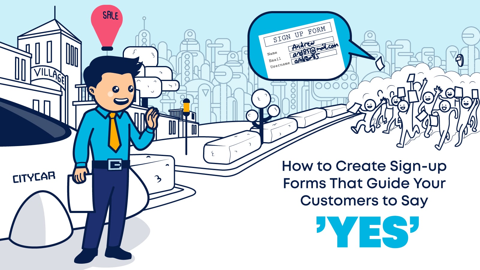

Sign-up forms are all that stands between you, subscribers, profit, and growth. In this guide, we’ll show you how to get out of your own way and help your customers say ‘yes‘ to your brand and your sign-up forms.
Before, there were webpages, email campaigns, and PPC ads.
No, wait. Let’s take it even further back!
Before there were print, radio, and television ads, there were traveling salespeople going door-to-door with their samples, hoping to convince potential customers to purchase what they had on offer.
The stakes were high. Imagine traveling miles to reach your customers and then coming up empty-handed.
That’s why every sale and each interaction mattered.
Salespeople couldn’t afford to have doors repeatedly slammed in their faces, so when doors opened, they immediately did their best to get in while quickly reciting a sales pitch.
And so, the famous phrase ‘getting a foot in the door’ was born.
That step over the threshold was a critical sign of progress. Because if you were invited inside, it meant the customer had given you permission to tell them about what you were selling.
Of course, some salespeople took getting their foot in the door a little too literally.
They would wedge their toes into a partially opened door to prevent it from being slammed in their face!
These salespeople didn’t understand that when they’re asking someone to engage with their brand or commit to making a purchase, it’s better to earn their attention than demand it.
Thankfully, going door-to-door isn’t the only way to connect with customers today. Technology gives us the ability to reach millions of customers by knocking on their digital doors.
However, one thing didn’t change.
Your chances of closing a deal go way up if you have permission to give your pitch.
That’s precisely what sign-up forms do. They help you pass the digital threshold and invite you into consumers’ homes.
A completed sign-up form signals that your customer wants to hear more from you. A completed checkout form means they liked what you had to say.

Could your brand get further with better sign-up forms?
The short answer is yes.
Sign-up forms are your go-to tool when you want to:
- Get the customer’s delivery and payment method.
- Invite prospects to sign up for a product or service demo.
- Request someone’s contact information in exchange for access to gated content.
- Allow someone to subscribe to your blog or newsletter.
- Add customers to your promotions or referrals programs.
- Secure communications and tickets for attendees in your next webinar or event.
Digital marketing thrives on data, and that includes information about the people who may be interested in your products or services. And this includes customers who have purchased from you in the past.
Using sign-up forms to gather this data is a smart way to expand and learn more about your target audience.
Sign-up forms also serve as proof of permission.
When your prospects give you their email addresses, they are signaling their willingness to hear from you again. This is important not only from a customer experience perspective but a regulatory compliance one as well.
Yes, in case you were wondering, GDPR, CCPA, and the likes are just the start, and complying with them is a must for your email deliverability.
Whether you’re using it to collect data to get your foot in the door or close the deal, each sign-up form is a touchpoint on your customer’s journey and a gateway through which you can begin a profitable relationship.
Getting your sign-up form wrong hurts your business, bad
Sign-up forms can be a powerful tool to help you build your audience and increase sales. However, a lot can go wrong, and unnoticed, if you don’t get them right.
- A simple mistake in your sign-up form, like failing to use accurate field labels, can cost you millions of dollars.
- A form that asks consumers to give too much may cause them to walk away. Etc.
Getting your sign-up form right is essential. Otherwise, you may get a door slammed on your (virtual) toes!
To avoid a cast on your feet, follow this guide, monitor behavior, and test every sign-up form you present to the public.
You’ll never find out from where there’s a leak if you don’t know there’s a leak, to begin with.
Why are your customers slamming their doors?
According to a mega study conducted by the Baymard Institute, which gathered 41 eCommerce studies:
- An average of 28% of your shoppers will abandon their cart because you asked them to create an account.
- And 21% will fail to complete the checkout process because it was too long or complicated.
Of course, we’re here to help you dodge that bullet.
In the next sections, we’ll show you how to collect the information you need without creating too much friction for your customers.
In addition, we’ll show you how to increase trustworthiness.
Remember, If your customers:
- Don’t believe that what you are offering is worth exchanging their data for.
- Or they don’t believe you’ll keep that data safe.
Your sign-up form is going to be a `sign-out from.’
<preparing the drum: ba dum tss>
Without further ado, let’s help you get that foot in the door and the engagement you need to close that deal!

How to engage and convert in sign-up forms
An effective sign-up form strikes a careful balance between incentive and friction. You need information, and gaining that information costs your customers time, effort, and perhaps distress about their data’s safety.
That’s the source for most customer frictions.
If you want your customer to incur those costs, you need to overcome that friction with the right incentive.
Our salesperson will not offer a free umbrella as an incentive on a midsummer day, and a bigger umbrella won’t make a difference.
Also, keep in mind the less friction your sign-up form causes, the less incentive you’ll need to offer.
Although it’s fascinating, before you start to deal with friction, you must understand how to emphasize the value you offer in exchange for your customers’ data.
To convince customers to invite you to visit their inbox or charge their credit card, you’ll have to establish WIIFM (what’s in it for me?).
Answering the WIIFM (what’s in it for me?) question
Moe: “That’s a lot of money for a lawnmower, ma’am.”
Jackie: “It’s not a lawnmower. It’s an all-terrain buggy! It can traverse muddy dunes with lawn mowing add-on capabilities that easily save you an hour and a half of back-breaking work each month.
Plus, you’re saving on diesel and electricity. It’s solar!”
When deciding whether to take the next step and share their information with your business, customers weigh the costs and/or risks of disclosing information against the value or benefits they expect to get in return.
For example, a customer who has already decided that your website offers the best deal for a product they want is more likely to go through the steps of filling out their shipping address and credit card information.
Investing in a longer funnel that increases the awareness to the offer’s value while helping the customer create a winning mental image of the offer are just some of the things you have to do to prep them up for the purchase.
Investment in awareness = you can ask for more + have a faster purchasing process.
However, If you ask customers to give you their data in exchange for an ebook or access to a webinar they first bumped into on your website, they may not be willing to provide quite as much information.
For example, Tony Robbins invests so much in awareness, supporting materials, brand recognition, and ‘consultation sessions,’ that once you come to his website, you come ready to pay for an eBook or even purchase his course.
Use your landing page and the text and graphics on your sign-up form to communicate the value of what you offer in exchange for the information you’ve requested.
But don’t let it be the only place they bump into your offer. The more the product costs, the more you’ll need to invest in explaining WIIFM prior to your form.
As you consider how you’ll communicate value, remember that perception matters. From your form’s appearance to its ease of use, your customers evaluate the value of completing it.
Remember, the factors that influence how they value the interaction aren’t always obvious, as shown in the study below.
A study in perspectives and perceived value
The Stanford Wine Study is a classic example of how perceived value can affect our decision-making process.
During the study, participants were asked to taste two different wine glasses while their reactions were measured using functional MRI brain scans.
Before they began the tasting, participants were told that one glass contained a $5 wine and the other a $45 wine.
Both glasses contained the same wine – but this basic fact did not matter.
The participants perceived the more expensive wine to be of higher quality. The fMRI scans revealed that they genuinely enjoyed drinking it more than the cheap wine. The perceived value of the wine had a direct impact on how they experienced it.
The perceived value does not necessarily relate to monetary value. For example, a childhood toy may have very little monetary value, but that does not matter to its owner. It has great sentimental value, which translates into huge perceived value.
I should know. I have my own Tolkien/Dungeons&Dragons collection!

How to increase the perceived value?
There are many ways to increase perceived value. We won’t dive into all of them. But we will talk about the must-haves.
Without them, all the rest won’t matter.
Must-have 1: Design a great experience prior to the sign-up form
First impressions really count with clients. We wrote an extensive post about welcome emails and how they color the entire customer journey from that point onward.
Sign-up forms and the website design are the scenery your customer travels through before the welcome email, and they are equally important.
Branding and landing pages that look good, have a smooth UX, and encourage the customer to convert by their sheer awesomeness will ramp up your perceived value.
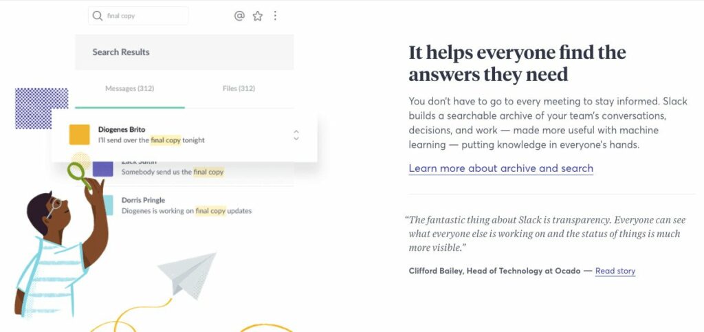
This example from Slack shows how it’s done.
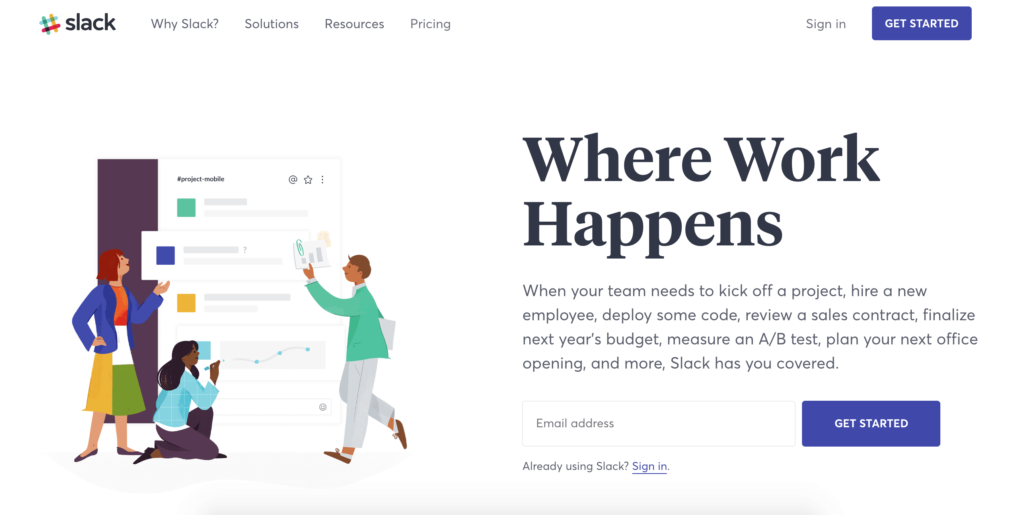
The CTA is clear, the graphic style is consistent (but not overwhelming), and the page as a whole looks sleek, even sophisticated.
Add to that the fact that each step is explained clearly, which saves viewers valuable cognitive resources, and you have a recipe for success.
Must-have 2: Make sure the price is right
As the Stanford Wine Study shows, price and perceived quality have a close relationship.
People are used to associating expense with quality, so raising the dollar value of what you are offering can be a quick way to give your sign up more intrinsic value.
However, don’t go overboard! You don’t want to price your target audience out of the market. It’s also worth remembering that people love a bargain.
Use your pricing power carefully. You want to make your product seem high quality – but also want your customers to feel like they’re getting a good deal.
Finding that pricing sweet spot can be a process of trial and error. It’s worth doing some market research to find out what’s reasonable and then test out pricing strategies until you find something that works for you.

Must-have 3: Show your company’s culture
Moe: “Wow! I’m so glad I let you in. That dinosaur park of yours sounds really amazing and safe!
Does everyone get to wear the explorer uniform you’re wearing?”
Jackie: “Sure! And it’s even biodegradable, which helps when you traverse with your all-terrain buggy in the Tyrannosaurus Rex encampment.
It’s a fragile ecosystem, and we believe in leaving zero waste!”
Perceived value is important for a brand itself as much as it’s important for their products.
People are more likely to commit to a brand they trust, like, and feel safe with.
Being ethical and authentic in your dealings with customers is a good starting point.
Take the time to build up a positive reputation that will help you to push your potential customer down the funnel.
- Social proof – including testimonials can be an excellent way to do this. We are a learning species, and one of the ways we learn is via proxy. Seeing (or reading) is believing. Lucky for us, velociraptors didn’t cut the cut.
- Add security badges – showing that serious institutes vetted you increase your trustworthiness.
- Giving back – things like donating to charity and making your ethical policies clear can also raise your perceived value as a good and trustworthy brand.
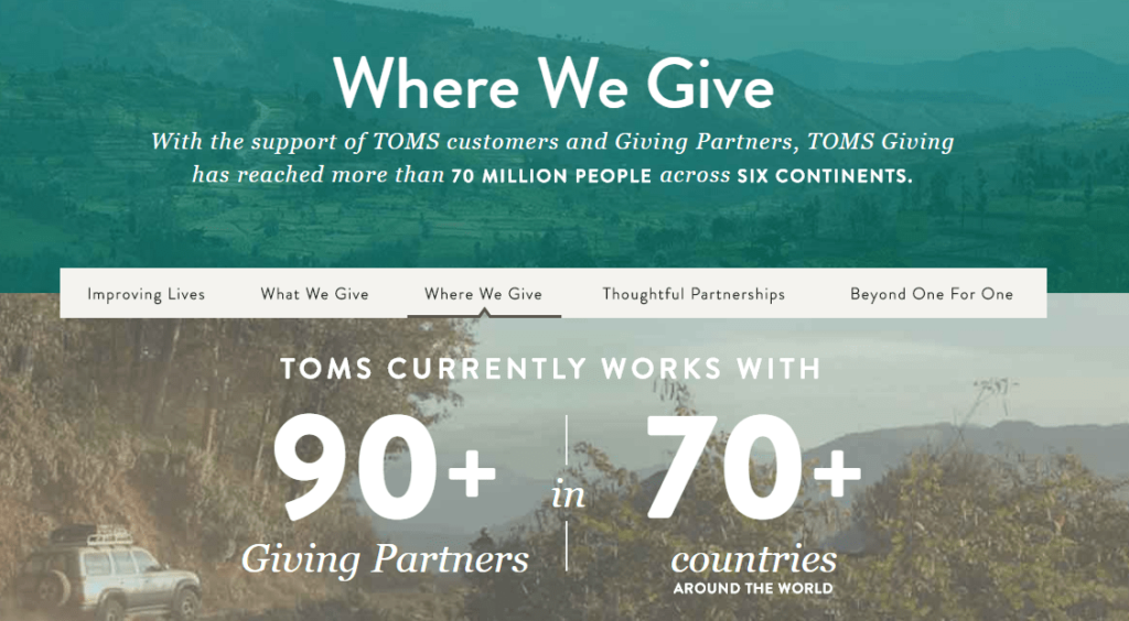
TOMS is a classic example of a brand that’s raised its perceived value through ethical practices. For every pair of shoes bought, they donate a pair of shoes to a child in need. TOMS’ giving program has become as much a part of their value and USP as the shoes themselves.
Presenting a valuable offer will take your customers a long way towards deciding to share their data with you – but for that to happen, your sign-up process needs to be smooth and persuasive.
Each step in the sign-up process is a micro-touch point on their journey, and your customers may decide to turn away if the going gets too tough.
Let’s remove that friction.
How to minimize sign-up form friction and keep the momentum going
The best way to get customers to complete their journey–whether the endpoint is signing up for your newsletter or completing a purchase–is to remove any obstacles. That means making your sign-up forms clear, easy to understand from start to finish while avoiding objections.
Below we outlined a clear strategy that removes friction and objections from your sign-up forms. We recommend that you follow it step by step:
Design with the form’s functionality in mind
When designing the appearance and fields for your sign-up form, remember that it needs to be user-friendly.
The design and format of your form (its user interface), as well as the amount of information it requests, all affect the form’s user experience. Bad user experience increases the likelihood that someone will abandon your form without completing it.
The proverb, “it ain’t over until it’s over,” is especially true in sign-up forms.
A customer may be on the point of committing but back out at the last moment because something just doesn’t feel quite right.
The flow of the form, the structure, design, everything can impact that conversion. You’ll have to test and see what works, and not just go with your gut feeling.
In sign-up forms, the design must include testing scenarios.
Don’t make customers repeat themselves
Have you ever signed into a website with your name and password, selected items, and placed them in your cart? It felt great, right?
How did you feel when you’ve been asked to log in again to checkout?
We all experienced some lousy onboarding experiences in our lives.
Another great example of a proverb that works well here is “do unto yourself as you would do unto others.”
No one likes to repeat themselves. It causes friction and makes for a bad user experience.
When your customers re-enter information that you’ve already collected, their trust in your brand takes a plunge, and you can be sure that they’ll never do it again.
Salespeople with a multitude of forms are a thing of the past.
Give your customers a shortcut with social logins
Do you really need your customers to leave their details? If not, why not let them skip the sign-up form and just use their social login instead?
Design app for the masses, Canva, uses Facebook’s API to offer its customers the following registration option.
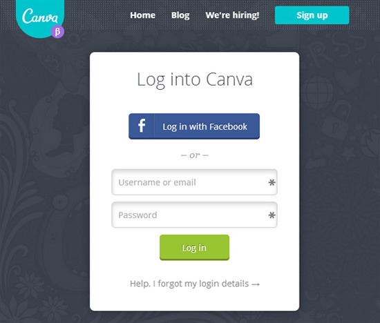
However, you need to remember that social logins help their product post the images designed there to social media.
In their case, the value was shared both ways. The customer gets in quickly, and Canva can answer its business needs with no hassle.
Before you decide to use social logins for your customers, consider the pros and cons.
Social or “login with Google” sign-ups make logging in easy for your customers.
When using social logins, the customer gets what they want with minimal effort. They may also feel safer because they don’t have to share their information directly with an unfamiliar brand.
Further, Customers who are logged in via their social account can also share their shopping finds to their social feeds easily–you may gain valuable social proof from your newly connected customer!
And if that’s not enough, using a one-click or social sign up also eliminates the forgotten password problem.
On the other hand, social sign-ups may be a turn off if your customer base isn’t active on social media.
In addition, you may not have access to as much data as you would if your new customers entered it directly, and the data you get from their social media account might not be accurate.
Sounds less than perfect? There’s more.
Using another platform’s API also means you have to share data with them, and you have to trust that they will keep that data secure. You’ll need to disclose any data sharing arrangements in your privacy policy and be on the lookout for potential data breaches.
This also means that you’ll need to clarify what the social platform can learn and share about your customers.
They might not want everyone in their social circle to know what they’ve purchased or the newsletters they subscribe to. Can you guarantee that their information will remain private?
You may also find instances where customers can’t use their social sign-in to log in on to your website–some schools or workplaces block users from accessing social media platforms.
Design an accessible and fitted to perfection form
Accessibility is vital in everything you do – but especially so when you’re trying to encourage people to commit to your brand. If, for example, someone with visual difficulties can’t see the form field text, they’ll become not only frustrated but will feel excluded.
Many of the best practices we share in this section, such as using clear labels and providing examples, also improve accessibility.
You can easily add accessibility to your form by offering voice-to-text entry. You can also use text or symbols to indicate status changes or waypoints rather than rely solely on color changes.
Further, unusual field sizes are not something beautiful to behold or pleasant to experience. It’s worth investing in creating field sizes that make sense from the get-go.
There are rules of thumb that you can easily apply. But using common sense helps too, for instance:
- Make sure that your sign-up form is responsive, or at least doesn’t break frames in certain resolutions.
- Use shorter blocks for zip codes or state abbreviations.
- Use broad fields for addresses.
If your fields are narrow or placed too close together, tapping becomes impossible, which angers your potential customers, and directs them towards the exit.
Right-size your request
Before asking your customers to enter their information, ask yourself how much data you need.
- Am I really going to use these segments?
- Is it worth having fewer sales and a smaller email list as a result?
If not, one or two fields may be all you need.
If you are using the information to qualify leads or segment your email list later, you may want to ask for more information. And that’s legit.
Traditionally, the more information you ask for, the more likely it is that consumers will balk.
On the other hand, the more information consumers are willing to share, the more committed they are to engaging with your brand. A few case studies have found that shorter forms don’t always yield the best conversions.
By asking more questions, brands achieved up to a 226% increase in conversion rates. To top it off, this increase contains leads who are more qualified.
You may need to experiment to find your sign-up form’s ‘right-size.’
Maybe your brand could ease customers into sharing more information after asking for an email first? Duolingo is an excellent example of this.
To start learning a language with Duolingo, all the user needs to do is provide their email address. Technically, they never need to provide the app with more data than that.
However, Duolingo will regularly encourage users to add more details to their profile.
As the customer progresses with Duolingo, the benefits of things like telling the app where they live (in order to connect with other customers in their area), etc., become apparent. It’s a long but very effective example of the ‘foot in the door’ technique.
Label everything clearly
The instructions for filling in your form should be as clear as possible. Place labels above each field so that they can be viewed even as data is being entered.
Including example text in your fields will help guide people who register for the correct format and information.
Don’t add placeholder text in your fields. This will add extra steps to their process and may lead to entry errors. It does no good to gather information if it’s inaccurate.
Keep your navigation simple
Because they aren’t as common, using a dual-column format for your sign-up form may seem like an excellent way to stand out. But, sometimes, there’s a reason the format isn’t popular.
Users confronted with two columns may feel overwhelmed, trying to figure out which direction to go next.
Is it down then over like an “N” or across then down like a “Z”?
If your form asks for a lot of information, consider using a multi-stage form instead of multiple columns.
Make it mobile friendly
Half of the world’s web traffic comes from mobile devices, and the number of consumers shopping via mobile climbs each year.
As you plan your sign-up form’s content and design, keep mobile users and their screens in mind.
Top-aligned field labels for easy scrolling, uncluttered pages with light graphics, and predictive fields that reduce keystrokes all improve your mobile customers’ experiences.
Keep your form’s visuals crisp
Strategically placed high contrast highlights and easy-to-read font will help draw your customers’ attention to the right places on your sign-up form.
Don’t overdo things with too many attention-grabbing details. Keep your visual messaging clear and consistent.
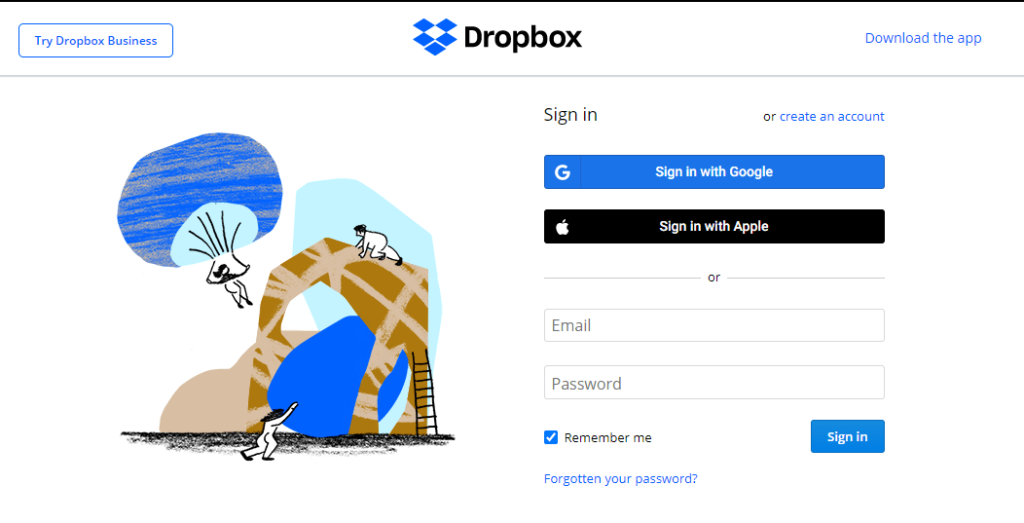
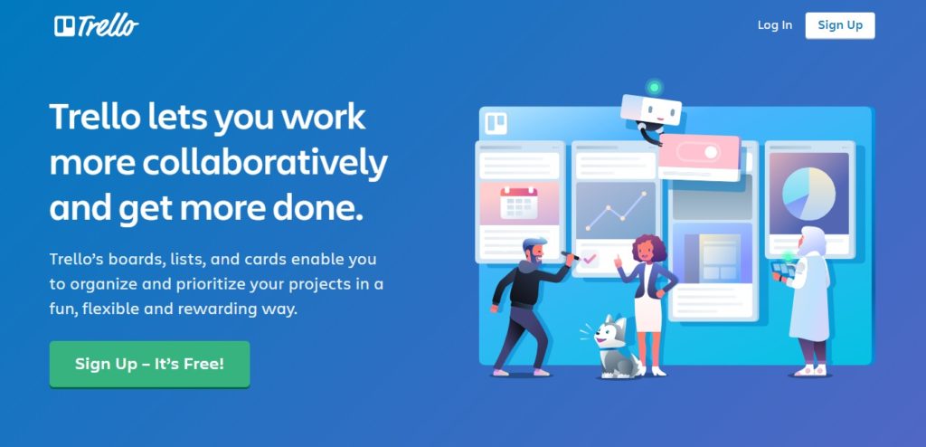
For example, look at how the color and placement of these CTAs from Dropbox and Trello make the copy stand out.
Provide adequate instructions
If your form asks for information that goes beyond the expected, give your users some guidance.
For example, you might explain why you need a particular piece of information or demonstrate how to format a date or phone number field. If your sign up includes a promotional offer, be sure to explain how people who sign up will receive what was promised and how they can contact you with questions.
To avoid adding too much information to your form, add links to resources where your customers can get more information. But try to avoid taking them off-form.
Tooltips and live chat boxes are a great way to go about it.
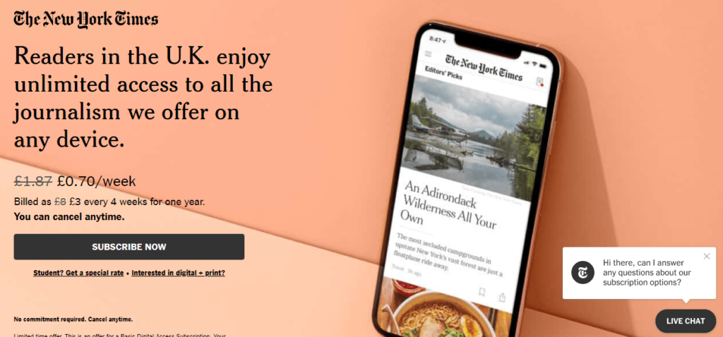
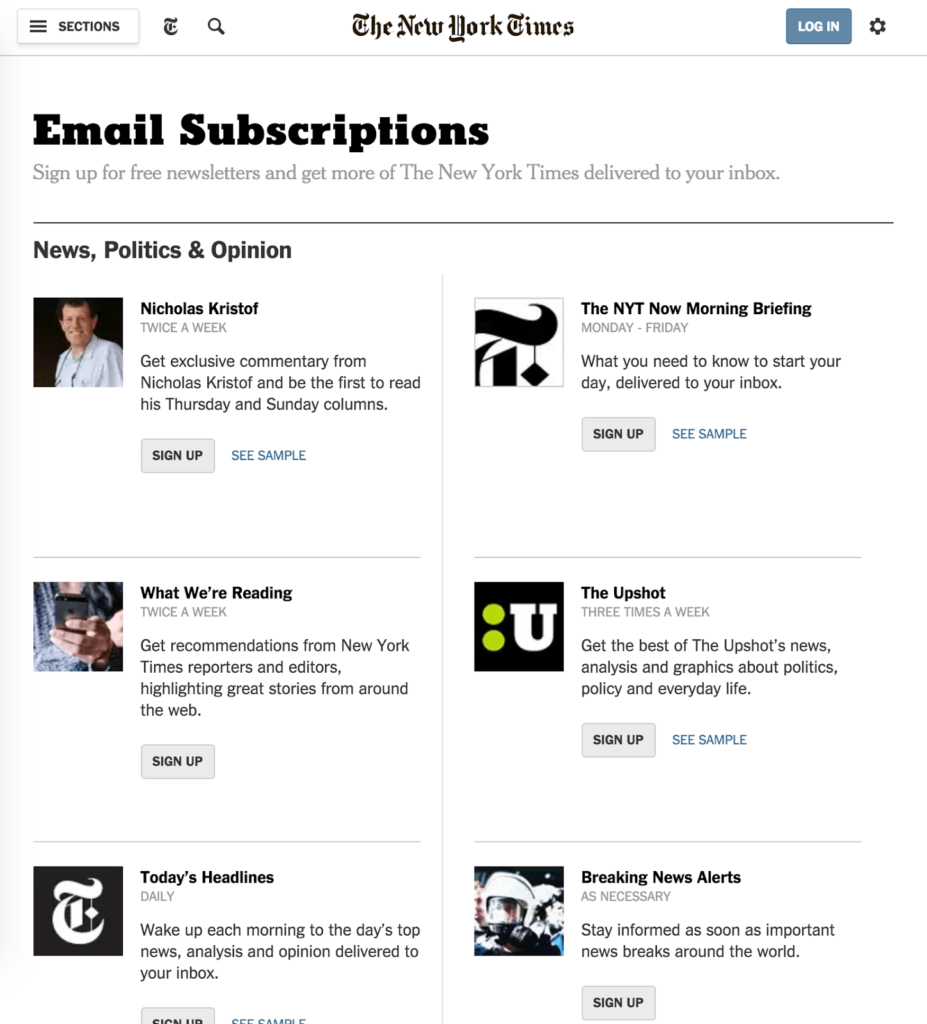
Check out the live chat button in the bottom right corner of this sign-up form from The New York Times. Now that’s service!
Let customers know what is wrong
Filling out a form, hitting submit, and then nothing. Did the information go through? Is it still loading?
If there’s a problem with your form, make sure your customer is alerted with notifications that will help him/her to fix it.
Don’t rely solely on red letters or other visual cues to alert customers to an error in their form entries. Provide a written explanation.
Look at this example from Facebook’s sign up page.
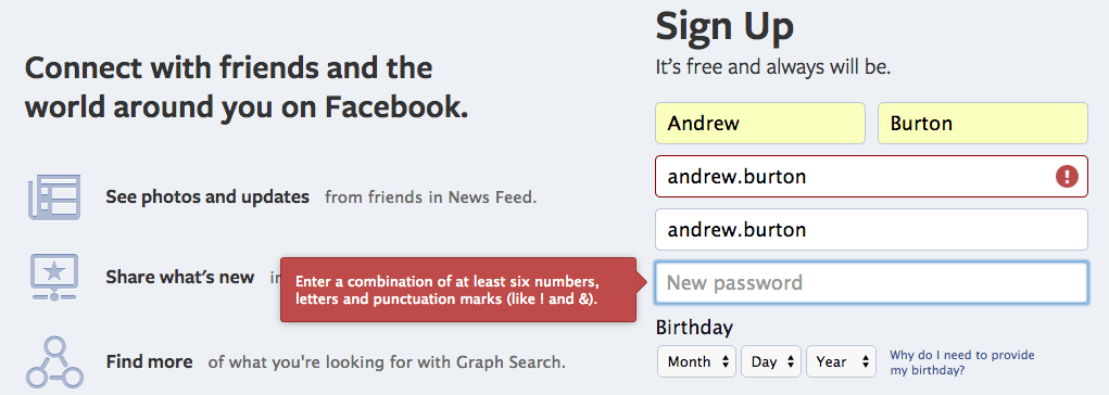
Notice how the error has been identified with a colored border and a symbol pointing to the problem. There’s also a highlighted written explanation clarifying how the problem can be fixed.
Clear and accessible.
Use visual and other cues to signify success
In addition to highlighting sign-up form errors, let your customers know when the process is going well.
Use progress bars to indicate how much more data they’ll need to enter and consider greying the final submit button until all the fields have been completed.
Remember to provide signals that support accessibility, such as a checkmark or text next to your submit button, too.
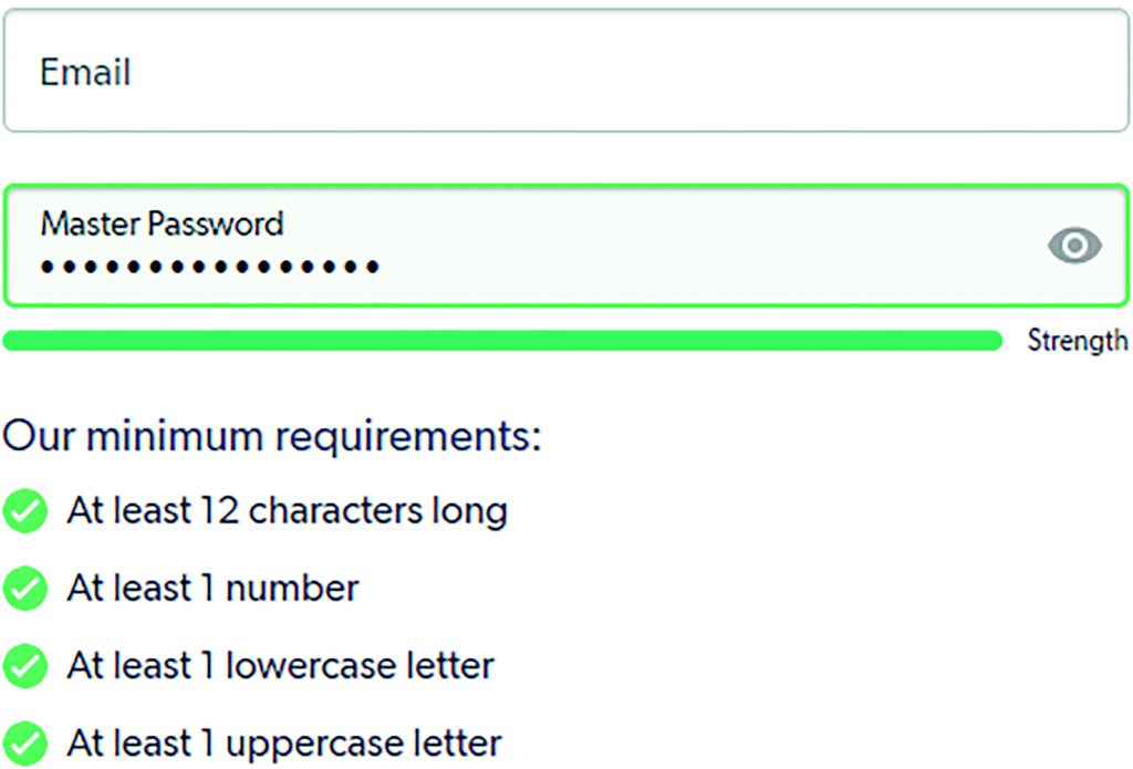
Spell out password requirements
If you need to require a password, then make sure the requirements are clear!
Provide a list of requirements under the password field and let consumers view their password as they enter it so they can confirm that they’ve met those requirements.
Use color and text to indicate password strength to encourage your customers to create an effective one.
Avoid extra clicks. And no, dropdown menus are not the answer
The best way to identify friction is to go through the journey you set out for your potential customer. If you want your potential customer to click less, test your form, and count how many clicks and keystrokes it takes to complete it.
Too many clicks might create friction, so it’s up to you to find how many steps you can remove.
However, there are do’s and don’t even here.
Throughout the years, innovative ways to ‘cram more data’ into sign-up forms (without sending customers to click around) came to be. That’s how we have dropdown menus.
But much like most patched up solutions, in sign-up forms, it can cause more trouble than it’s worth.
Before deciding to include a dropdown menu to gather data about prospects, consider the possibility that the information you gain might not be accurate, for example:
- Have you ever been presented with a drop-down menu that lists more than five choices?
- Have you been tempted to choose the top option just to keep things moving?
- Or, maybe there’s no choice that is a match for you, so you choose a random option. You may even feel excluded or overlooked.
Bad UX can lead to bad data.
In addition:
- Dropdown menus are a notoriously known UX headache.
- And they’re not mobile-friendly.
Let’s drop the dropdown menus.
Just say no to Captcha
Does anyone enjoy trying to guess if that item in the corner is a truck or a van?
No one likes Captcha, and seeing it on your form may be enough to cause some of your customers to shut the door.

You pray for their poor soul Matt, you pray!
Instead of trapping souls, consider the following for keeping the bots at bay:
- Double opt-in – after your customers submit the form, double opt-in send them a confirmation email before adding them to your list. This ensures a real and interested human being sits behind the screen.
- Hidden form fields – these are honeypots for bots, which don’t know the difference between a visible and a hidden field, filling everything. When you have a form with filled hidden fields, you can easily filter out the bots.
- Real-time verification services – connect your sign-up forms to one of these services to ensure these email addresses are legit and valid before adding them to your email marketing list.
Now that we removed friction from your forms let’s look at how to give your customers a little extra nudge just in case they are hesitant to take the next step in their buyer’s journey.
Overcoming sign-up form objections with persuasive strategies
Removing friction and offering incentives gives your customers reasons to say yes. But what if that’s not quite enough to get them to share their valuable personal data with you?
There are a few more steps you can take to get that digital door to open.
Start building trust with transparency
When you ask customers to fill out a sign-up form, you are asking them to trust you with their data. Before that happens, you have to demonstrate that you are trustworthy.
This is easier to do with some customers than others. A good start (and a legal requirement*) is to disclose your data use and privacy policies.
Add a clear statement on your sign-up form that links users to your data protection and privacy statements so they can read and decide for themselves if you use their data responsibly.
In this example from Grubhub, links to its privacy policy and site terms appear at the bottom of the form.
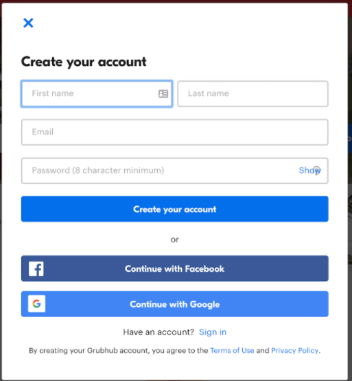
Make sure you’re following the rules!
There’s a door between you and your customers. You wouldn’t enter your foot in forcefully or break-in, right?
No one can trust you after that.
Due to GDPR, in the EU, checkboxes are required on sign-up forms, as people have to ‘opt-in’ to sharing their data. In other areas, it is acceptable to use the sign-up as proof of data consent without checking a box.
This year, CCPA was introduced in California. As we mentioned earlier in this post, this is a trend, so be transparent about data and privacy, put the customer in control, and obey the laws of each jurisdiction where you do business.
Keep up appearances
Yes, they say you shouldn’t judge a book by its cover. But we do. Appearances matter.
You won’t open up your door to a scruffy-looking nerf herder, right?
If your web page, sign-up form, or any other element of your digital presence looks outdated or, as the kids like to say, “sus,” consumers are going to be reluctant to share their data with you.
If you want to encourage sign-ups, make sure your website has a consistent, professional, on-brand appearance through and through.
Give something awesome, no strings attached
We already mentioned incentives or the WIIFM (“what’s in it for me?”) part of your sign up offer. But we didn’t say that giving something does more than balancing the risk/reward scales in your favor.
When you give someone something they consider valuable, it makes them feel obligated to give you something back. This social norm is referred to as the rule of reciprocity.
Usually, brands offer a discount or gift if someone signs up for their email list. But what if you came up with a unique way to start the cycle of reciprocity by giving your customers something before they sign up?
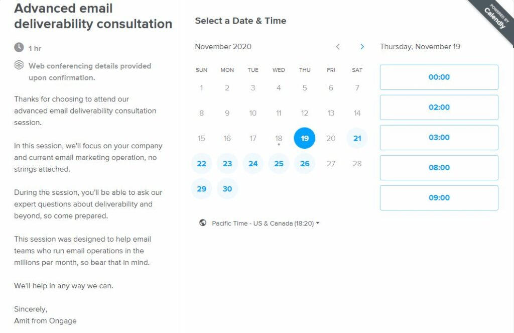
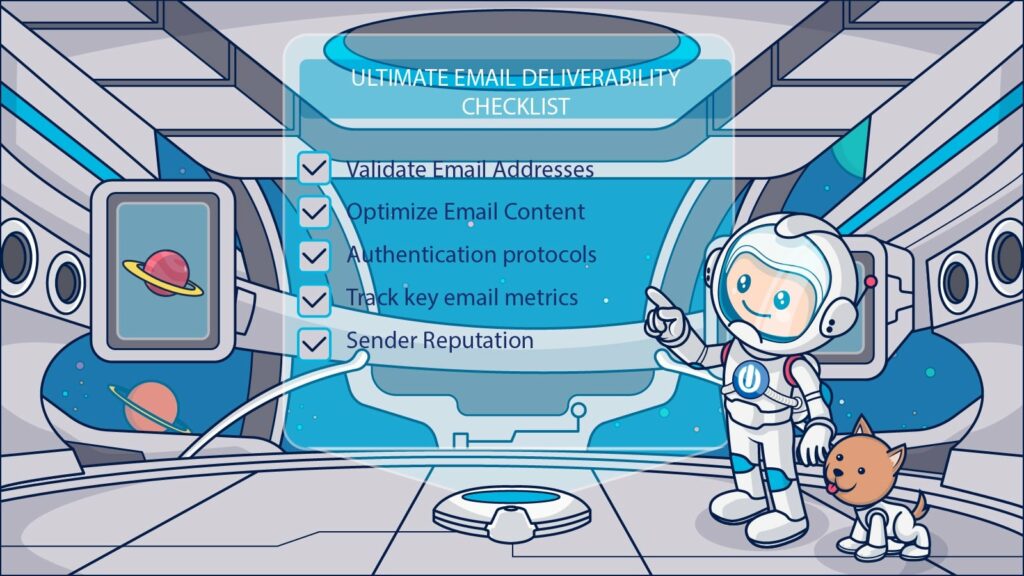
At Ongage, we provide a 60-minute consultation with an email deliverability expert for brands who send email campaigns in large volumes.
We offer them to schedule a session via Calendly, with no commitment.
Here’s the text we use:
Get others to vouch for you
Another well-known psychological trigger that nudges people closer to yes is social proof.
Consumers are far more influenced by what other consumers have to say about your brand than any assurances you could offer them. Don’t be afraid to share customer testimonials on your sign up pages.
To encourage customers to click-through to learn more, Slack includes a short testimonial from a featured customer along with a link where customers can read more.
Get the ball rolling with a small yes
Getting a customer to say yes to something small is a great way to get them to say another yes to something bigger later.
Similarly, it is easier to get someone to make a low-risk purchase before asking them for a larger commitment later.
To use this strategy, try breaking your requests for information into smaller chunks.
For example, ask for an email address to get someone to sign up for your newsletter. Then, ask for a bigger yes (and more information) in a follow-up email.
Using a multi-stage form that begins by asking just a few questions is another way you can give your customers a small nudge before moving them toward a bigger request.
Make your customers feel special
People are unique and like to be seen as such. And while they may object to brands using their personal information for business gains without their permission, most don’t object to a little personalization when they engage on a brand’s website.
According to a paper published by Klarna, an eCommerce payment service provider, personalization is a must, and if don’t get something personal, well, see below your loss:
- 33% say that personalized offers and discounts would encourage them to shop with an online brand.
- 24% would abandon a purchase if the retailer’s website didn’t remember them.
- 19% would abandon their purchase if they didn’t receive a personalized offer.
For that same reason, salespeople would mention the customer’s name a few times during their sales pitch.
We love seeing and hearing our name.
Catchy copy and clear CTA
The fewer words with which you can communicate, the more important each one is. Make sure the copy on your sign-up form and its landing page is clear, concise, and powerfully communicates your value proposition.
Pay particular attention to your call to action (CTA). It should tell consumers what you want them to do and why they should do it.
Plan to invest plenty of time testing different value statements and CTAs. And don’t just test your copy. Experiment with color, position, and method of delivery too!
From a foot in the door to a firm commitment
Sign-up forms are an important tool for gathering information and gaining entry into your customers’ digital space.
Checkout forms fill a different role.
These forms are the gateway between the customer and your product. This touchpoint is critical to the buyer’s journey and your bottom line.
With so much at stake, it’s no wonder that brands have developed many different strategies and styles for checkout forms.
Checkout forms require extra commitment from customers, and that’s why they need extra effort to prepare. We’re going to discuss some of those extra touches and share examples below.
Figuring out which forms are a fit for your customers requires testing, and the best place to start these tests is with the number of stages in your form.
Multi-stage checkout process and how it guides consumers from start to finish
Multi-stage forms are several forms combined into one.
Because check out forms are more complicated, some brands opt into using multi-stage checkout forms that take the customer through entire journeys in one form.
Multi-stage checkout forms present consumers with a set of fields that they must complete before progressing to the next stage.
The stages are divided into sections based on tasks or categories.
For example,
- In the first stage, the customer would confirm their purchase choices.
- Then, they might proceed to a second page where they are asked to enter their shipping information.
- Finally, they’ll reach the last page, enter their payment information, and confirm the purchase.
But are small steps the best path to a successful checkout form? You’ll have to be the judge of that test.
A multi-stage checkout form has both advantages and disadvantages
On the plus side, a multi-stage process may be less overwhelming to consumers than being presented with a long series of questions and input fields on a single page. It also allows the retailer to divide the information it is seeking into categories, which eases customers’ cognitive load.
Perhaps most importantly, multi-stage checkouts also help marketers to optimize their sales process by clearly showing the points at which drop-off is most likely to occur.
E.G.,
- Do customers abandon their carts when they see the cost of shipping?
- Or, is it when they are asked to enter their phone number?
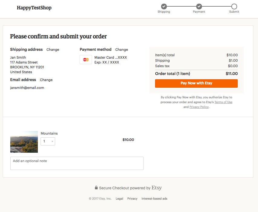
In this example, Etsy uses a multi-stage process for their checkout. This helps customers manage their information in smaller chunks. The customer’s stage in the process is indicated by the progress bar in the top right of the checkout screen.
A multi-stage approach is probably the best way to collect as much data as possible during the process. But there’s a price, complexity, and through it, friction.
Does your brand really need so much information that it requires multiple pages and fields to gather?
If your brand needs this information, it’s worth it.
Today’s online sellers are competing against titans like Amazon and its ‘1 click’ buying option.
Consumers now expect a seamless purchase process – one that keeps their credit card details completely secure. This is a big ask for the humble checkout form.
Overcome your customer’s fear of commitment with low-entry options
Limiting the length of your checkout process and the number of fields required is particularly crucial for mobile checkouts.
Clicking through multi-page web forms on mobile can be an agonizingly slow and frustrating process – definitely not ideal when you’re shopping on mobile during your commute.
To shorten your customers’ paths from pick to purchase, use strategies that reduce the amount of information they have to share with your brand or the level of commitment they need to make.
Offer low-commitment payment options with embedded payment processors
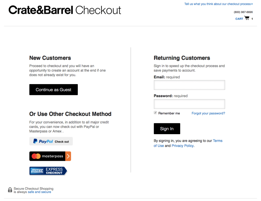
Digital embeds to reduce keystrokes are one way to reduce the purchasing efforts your customers make. Embeds from PayPal, Amex, and Mastercard make the checkout process as close to 1-click as it can be.
For example, Crate & Barrel allows customers to select their embedded payment process of choice to complete their purchase.
Guest checkout for the customer who is committed today but isn’t sure about tomorrow
Allowing customers to shop as guests is another method that retailers use to close a deal without getting the door shut on them.
Creating an account when going through checkout is common practice, but it comes at the cost of the customer’s time. It also frustrates customers who are purchasing items as gifts or making a one-time purchase.
They often end up on brands’ mailing lists as less engaged customers that can put your email deliverability at risk.
Forcing a customer to create an account to purchase on your website can be a little like the pushy salesperson who wedges his foot in the prospect’s doorway. Just because someone agreed to engage with you doesn’t mean they want to invite you inside for a long chat.
Creating an account to save time can also be counterproductive. In a 2020 survey, 27% of UK shoppers said they had abandoned their carts because they couldn’t recall their login details!
In a separate study, 28% of U.S. shoppers said that being required to create an account was their reason for walking away from the transaction.
While it may seem like a can’t win situation, it’s not. Offer your customers the option to check out as a guest.
Sure, it’s a compromise, but you won’t be missing on anything except the deals that you wouldn’t have closed anyway.
Here’s how Macy’s presents its customers with that choice.
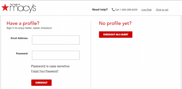
Notice how it’s clean from noise and judgment. They just ask you to go for it.
The subscription sign-up forms
Paid subscriptions are a type of purchase and require a checkout form. They are also subtly different. A subscriber agrees to a commitment for a set period instead of making a one-time purchase.
A lot of services require recurring subscription-based payment. Among them, you’ll find SaaS products, fitness apps, games, etc.
Subscriptions require you to address questions about auto-renewals, cancellation policies, and similar issues. Your customers may need extra reassurances before they are willing to fill out the checkout form and fully commit to subscribing.
Paradoxically, the buyer’s journey for subscribers may be shorter than when customers purchase a product.
For example, Drift asks for the bare minimum before they start your free trial. In fact, they employ a strong CTA that doesn’t even mention a trial.
It tells you what’s going to happen next.

Here’s how we make it easy for customers to commit at Ongage:
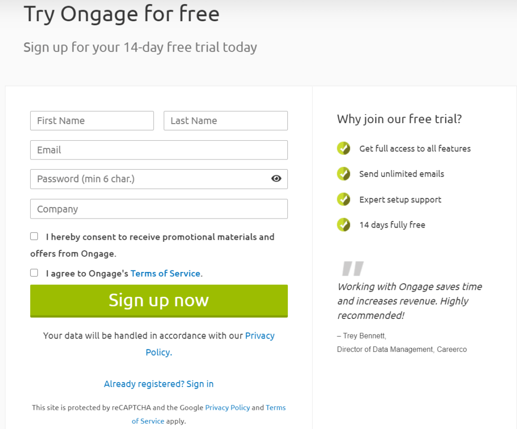
To convert prospects into subscribers, we employ many of the best practices shared in this article.
We’ve also demonstrated our confidence in our product and make its benefits clear with a free trial offer. Interested customers can sign up for 14-days of free access to Ongage’s features, including unlimited emails, expert help, and support.
Offering a free test drive of your subscription is a spot-on incentive for interested leads and a good way to convince customers to commit.
As you consider how long of a free trial to offer, keep this conversion trick from Joseph Sugaman, the author of The Adweek Copywriting Handbook, in mind.
He says that a customer who feels rushed to decide to keep something may reject it not because they don’t like what you are selling, but because they are afraid they won’t like it and will be stuck with it!
Your customers are busy. If you are going to offer them a free trial (or a money-back offer), give them plenty of time to evaluate your product. As an added benefit, offering an adequate trial period communicates your confidence that they will like what they experience and become long-term subscribers.
Testimonials are part of our sign-up strategy as well. Our sign-up page includes social proof from satisfied customers. We also employ a high-contrast CTA button along with a checkbox inviting customers to sign up for our newsletter.
The form is designed to be easy to understand – and super-easy to use.
Enrolling customers for a streaming service subscription
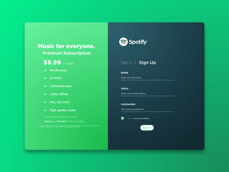
A digital service subscription may require customers to provide more information than other types of purchases or subscriptions.
Music streaming services like Spotify need access to customers’ devices and audio equipment. These services usually collect preference data to enhance the customer’s experience as well.
To keep from overwhelming new customers at sign-up, Spotify asks for all the information and permissions it needs in stages. The brand also takes care to use other optimization elements to keep its sign up process on track.
The sign-up form sections are clearly divided by color and theme, with the form itself in contrasting black and white to make it stand out.
The information section tells the customer very clearly what they will get, how much it will cost, etc. Everything they need to know can be seen at a glance – there is also a ‘learn more’ option for customers who still aren’t convinced.
Once the app is installed, different service options become available as and when the user enables them. Usually, their device will ask the user to give the app permission to carry out a certain service – to run in the background, for example.
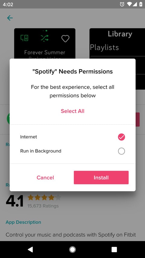
Consumers also have the option to enable all permissions at sign-up. Regardless of when the permission request is made, it’s always a good idea to explain to users precisely the permissions your service will need.
Checking in for explicit permission on an ongoing basis helps the customer to feel in control of their devices and their data while also positioning you as a courteous and trustworthy service provider.
Examples of sign-up forms that get it right
You’ve learned about some of the best strategies to get your virtual foot in the door.
For inspiration, here are real examples of the different types of sign-up forms brands are using and how they get their customers to engage.
The ‘keep in touch’ sign-up form
When all you need is a way to stay in touch, go with a simple sign-up form. Keep your fields to a minimum and make it easy for customers to say yes.
J.Crew’s smooth, personalized process
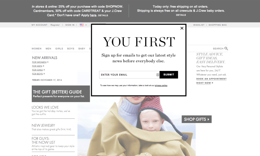
This version of J.Crew’s sign up is short and sweet. The user only has to enter their email address to get on the newsletter list. To encourage visitors to make that commitment, J.Crew employs:
- Real lead magnets promising ongoing benefits. Potential subscribers learn that they will get the “latest style news before everybody else.”
- Snappy copy that focuses on the reader, making them feel valued by the brand.
- A standout CTA in a contrasting color box that draws the eye.
- On-brand styling that matches the website’s tone of voice and design. Users will recognize the message as coming from J.Crew (and not a malware pop-up), and the design drives home the message that the newsletter content will have the J.Crew tone, content, and branding that they (hopefully) already love.
- A link to the brand’s privacy policy to reassure consumers that the brand takes their privacy seriously.
J.Crew actually uses a variety of different sign-up forms. When actively signing up, another form invites customers to share their names and birthday.
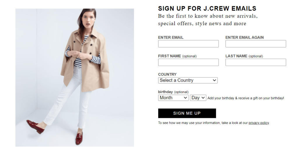
Notice how this form follows several best practices, including labeling the fields, explaining why they want to know your birthday, and pointing readers to the brand’s privacy policy.
That being said, it’d gain from abandoning the archaic dropdown. You can identify users according to IP and get their birthdays from inserted values.
Getting info after the sign-up
After getting that precious consent, you can ask customers, in a multi-step fashion, for more information.
This will ensure personalized and relevant content in future communications and will strengthen your relationship.
The New York Times gets a `Yes’ for regular content deliveries
Lindsay Goddard of the New York Times put a lot of effort into the paper’s newsletter subscription process and it pays off.
Readers who subscribe to their newsletter:
- Consume twice as much content as non-subscribers.
- Spend 80% more time on the NYT site.
- Are twice as likely to purchase paywalled content.
To get newsletter subscribers, the NYT uses a multi-stage process.
First, all New York Times readers are asked to register an account by providing an email address.
Once this first small “yes,” has been obtained, the brand can nudge readers toward the next step of subscribing to one or more of the NYT’s newsletters.
Friction is reduced at this next touchpoint because the publisher already has the information it needs. (Remember that simple email sign up?)
Now, all the customer has to do to subscribe to various newsletters is click on the plus symbol next to the newsletters that interest them. The NYT then reinforces this touchpoint by sending an automated email confirmation to their new newsletter subscriber.
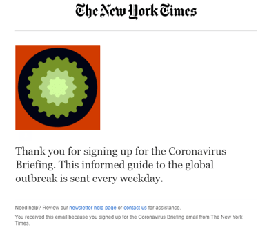
In addition, the process is quick and smooth – which is always an advantage in this era of short attention spans.
To pop-up or not to pop-up?
It’s true, pop-ups are your right salesperson, at the right time!
Of course, if they don’t come at the right time, they can be seen more as a stalker than a salesperson, so try to avoid that.
If your users are where you want them, capitalize on this by installing a subscription pop-up.
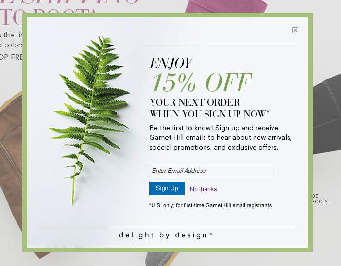
In this example from Garnet Hill, the customer’s attention is caught by an enticing offer that promises more of the kind of content they’re already looking at – but for less.
Be careful not to be like the pushy salesperson who shoves his foot in the doorway when trying this strategy, though. No exit intent pop-up will save you once your readers get annoyed.
Pop-ups can be very frustrating when they’re not easily dismissed. Your customer came to this page for another reason. If they can’t easily exit the pop-up, they may just leave your website instead.
Garnet Hill strikes the right balance between value and friction by:
- Ensuring that the branding and appearance of the pop-up match that of the webpage. The customer has come to this page expecting this kind of look and feel – so the pop up is not too jarring when it appears in the same style.
- Making it easy for uninterested consumers to find the exit. Don’t try to play tricks with your pop-ups.
Customers don’t like it, and it causes them to lose trust in your brand. Garnet Hill’s pop-up displays its ‘X’ clearly, and it’s located where the customer would expect it to be.
There’s also a clear ‘No thanks’ option next to the CTA. The customer can easily dismiss the pop-up and get straight back to the page.

Make yourself welcome by making sign-up forms easy
The salespeople of old would wish in their wildest dreams to be present in a time in which they can knock on the doors of millions of customers at once.
If they were with us today, knowing what we know now, and having the skills they developed back then, they would be unstoppable!
I hope we provided you with the keys to that type of unstoppable energy with the strategies, examples, and stories above.


 Academy